Configure
The Configure page of the Chart Configuration wizard allows you to configure the chart as required. The page consist of two tabs, Chart Configuration and Data Preview.
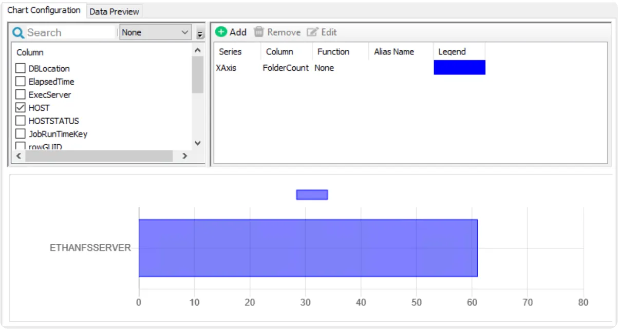
Chart Configuration
The Chart Configuration tab is split into three sections, label column selection, series configuration, and a chart preview. Use this tab to configure the columns from the data source to be shown in the chart.
The left side shows all the columns from the data source table that can be used for the label axis. For example, the label column is the x-axis on a line chart and the y-axis on a bar chart. Select the checkbox of the desired label column from the list. You can use the search bar to filter this list of columns.
If a datetime label column has been selected, you can optionally select a transformation function using the dropdown menu. Transformation functions group the column data by the selected function and the function is then used as the label. The possible transformation functions are Day, Month, or Year.
The table on the right is where the data series are configured. For configured data series, the table displays the series type (XAxis, YAxis, or DataValue), column name, aggregation function, friendly alias name, and legend color. Use the buttons above the table to add new or configure existing data series. The following options are available:
-
Add – Opens the Add new series window to configure a new data series. See the Add New Series / Edit Series Window topic for additional information.
-
Remove – Removes the selected data series from the chart
-
Edit – Opens the Edit series window for the selected series. See the Add New Series / Edit Series Window topic for additional information.
-
Color Picker – Available only for pie charts. Opens the Pie slices color window, which allows you to customize the color for each slice of the pie chart. On the Pie slices color window:
- Select the row of the desired value to customize and click Change Color
- Use the color picker to choose the desired color, then click OK
- Repeat for each color you want to customize
- Click OK to save your selections and close the Pie slices color window, or click Cancel to close the window without changing the colors
At the bottom of the page is a preview of the chart as it is currently configured using the available data. See the Chart Preview topic for additional information. Additionally, you can see a preview of the source data table in the Data Preview tab. See the Data Preview topic for additional information.
Once you have finished configuring the chart, click Finish to close the wizard. You are returned to the Widgets page of the Report Configuration wizard, where the newly configured chart is shown. You must complete the Report Configuration wizard to save the chart on the report. See the Widgets Page topic for additional information.
Add New Series / Edit Series Window
The Add new series and Edit series windows allow you to configure the data series of the chart. The appropriate window is opened by clicking Add to create a new series, or by selecting an existing series and clicking Edit.
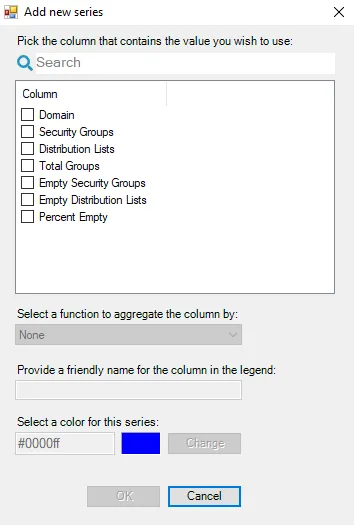
These windows contain the following options for the data series:
-
Column table – This table displays the available columns in the source table that are not currently selected in a series for the chart. Select the checkbox for column that contains the data for the series. You can use the search bar to filter the list of columns.
NOTE: The other options on the window are disabled until a column is selected.
-
Select a function to aggregate the column by – Use the drop-down to select an aggregation function. The available options vary depending on the column selected. The possible options are:
- None
- Average
- Count
- Count Distinct
- Maximum
- Minimum
- Sum
-
Provide a friendly name for the column in the legend – If an alias name is provided here, it is displayed on the chart instead of the column name
-
Select a color for this series – Click Change to open the color picker to customize the color for the series
Click OK on the window to save the new or modified series, or click Cancel to close the window without saving.
Chart Preview
At the bottom of the page a preview of the currently configured chart is displayed.
If the configuration is incomplete or invalid, a message with instructions to fix the configuration is displayed in the preview window instead. The following are possible messages and scenarios that would cause them:
| Message | Scenario |
|---|---|
| Following is the minimum requirement to generate preview: - From columns(left side) above, select at least one label column. - From series(right side) above, configure at least one series column. | - Series column not configured - Series with function and no label selected - None selected |
| Following is the minimum requirement to generate preview with the transformation function: - From columns(left side) above, select only one column of type Datetime. - From series(right side) above, configure all the series column with an aggregate function. | - Transformation function enabled with multiple label columns selected - Transformation function enabled but no aggregate function configured - Transformation function enabled, but no Datetime column selected |
| Following series should be configured with a function | - The transformation function is enabled but no aggregate function is configured for the series |
Data Preview
The Data Preview tab allows you to see and customize the data that is to be shown in the chart.
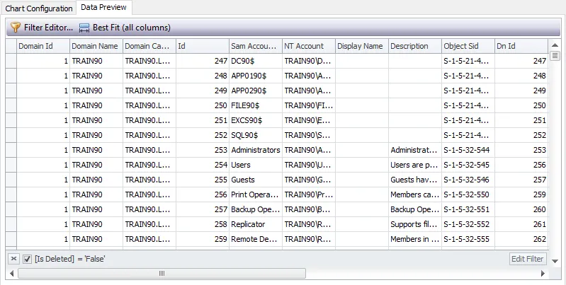
The buttons above the column names provide you the following options for configuring the table arrangement:
- Filter Editor – Opens the Filter Editor which allows you to add custom filters with conditional statements and logical connectives
- Best Fit (all columns) – Adjusts the width of the columns to display all the data within the cells