Widgets Page
The Widgets page of the Report Configuration wizard allows you to configure the tables, charts, and text that form the report.
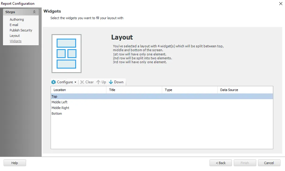
At the top of the page the selected layout is described. The table contains the available element locations where widgets need to be configured.

To add a new widget to an empty element, click Configure and select the desired widget type from the drop-down menu. The following widgets are available:
The editor or wizard for the selected widget opens. See the relevant section below for information about configuring it.
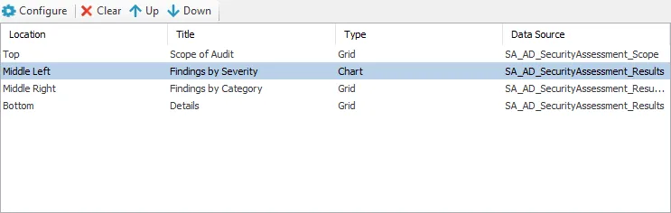
For configured widgets the table shows the title, type, and data source. You can perform the following actions by selecting a row and clicking the relevant button:
- Configure – Opens the editor for the configured widget
- Clear – Deletes the configured widget from the selected element
- Up / Down – Moves the widget up or down to the next element of the selected layout. If another widget is already configured in the element you are moving it to, the two widgets exchange places.
Grid
The Grid widget type allows you to configure a table to be displayed on generated reports.
Options
The Options section allows you to configure the title and data source for the Grid element.

The section contains the following options:
- Element Title – Enter a title for the element in the text box. This will be displayed in the element's header on the generated report.
DataSource Options
In order to generate results, a location must first be selected as the source of the data.
-
Table – Use the drop-down to select the required data source. The drop-down contains the list of jobs within Access Analyzer that have been executed.
-
Current job only – Select this checkbox to only display data from the current job. This option is selected by default.
-
Include all SA nodes data – Select this checkbox to display data from all Access Analyzer data tables
-
Show Historical Data – If there is historical data, selecting this option displays all collections. It is keyed off of the Job Runtime column.
-
Limit maximum number of displayed rows to [number] – Limits the number of rows of data displayed to less than or equal to the number chosen. By default it is set to 1000.
NOTE: Limits that are larger than the default may slow down the run time.
Export CSV Options
You can configure the table to allow the data to be exported as a CSV file.
- Export table data as CSV – Select this option to enable a report’s table section to be exportable
as a CSV file from the generated report
- When it is configured, you can click the All Data button on the table section of the report to save the report as a CSV file. See the Interactive Grids topic for more information.
- Rows – Limits the amount of rows exported to the CSV file. The default is Visible.
- Visible – Only includes the amount of rows set by the Limit Maximum number of displayed rows to option in the DataSource Options section
- All – Includes all rows of the data set
- Columns – Limits the amount of columns exported to the CSV file. The default is Visible.
- Visible – Only exports the visible columns (excludes any columns removed using the Column Chooser)
- All – Includes all columns, including those in the Column Chooser
Table Properties
The Table Properties section allows you to configure the display features of the grid.

There are two types of grid displays:
-
Interactive grid – Allows the viewer to interact with the table in the generated report. See the Interactive Grids topic for additional information.
-
Non Interactive grid – Creates a report with fixed settings and stationary elements. This option disables all the fields within the Table Properties section.
NOTE: In order to view user configured Grouping in emailed reports, the report must be emailed as a Non Interactive Grid.
The following settings are available when Interactive grid is selected:
Grid Properties
- Treat interactive grid contents as plain text (not HTML) – Enables interactive grid functionality. This option is selected by default.
- Enable Paging – Enables Paging in reports. Paging allows users to interact with large sets of data more efficiently when viewing, filtering, and sorting generated report tables by limiting the amount of data being displayed at a given time. Paging is enabled by default. See the Paging topic for additional information.
Column Properties
-
Group Column – Arranges the table to be grouped by the attributes of the selected column
NOTE: Paging and grouping are not compatible. When Paging is enabled, the Grouping options are disabled in the Table Properties section and in the generated report.
-
Enum Column – Groups the data in tables based on the selected column
-
Color Column – Colors a column data displayed on the report’s table section
-
Icon Column – Creates an icon that appears next to column name on the report’s table section
-
Path Column – Creates a column that displays the attack path within the report
Data
The selected data for the table is shown in the section at the bottom of the window. This section allows you to configure the data to be displayed in the table.
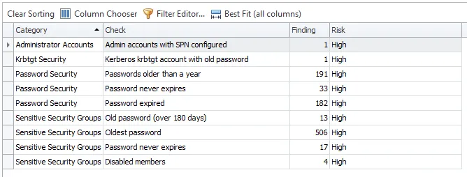
The buttons above the column names provide you options for configuring the table arrangement.
- Clear Sorting – Restores columns to the default placement
- Column Chooser – Opens a pane where you can remove unwanted columns or add hidden columns
- Filter Editor – Opens the Filter Editor which allows you to add custom filters with conditional statements and logical connectives
- Best Fit (all columns) – Adjusts the width of the columns to display all the data within the cells
Chart
Chart widgets allow you to create various chart types to represent data. A Chart Section can only display one chart type at a time. Charts are configured using the Chart Configuration wizard. See the Chart Configuration Wizard topic for additional information.
Text
There are two types of text editor that allow you to configure a text element on a report.
- Basic Text Editor – Provides basic functionality like font size and style. Works with HTML script.
- Advanced Text Editor – Provides advanced functionality like document formatting, inserting tables, and adding hyperlinks

When you first configure a new text element, a dialog displays allowing you to select the type of Text Editor. On this dialog, select either the Basic or Advanced Text Editor and click Open Editor. The selected editor then opens.
NOTE: Once a Text Editor is selected for a Text element, it cannot be changed.
Basic Text Editor
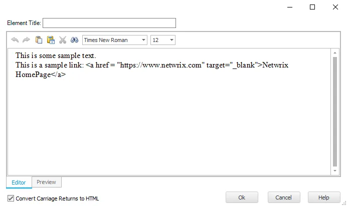
The Basic Text Editor has the following options:
- Element Title – Enter a title for the element in the text box. This will be displayed in the element's header on the generated report.
- Editor / Preview tabs – You can switch between the Editor and Preview tabs. The Editor tab allows you to edit the text and apply formatting. The Preview tab shows you how the formatted text will look in the generated report..
- Convert Carriage Returns to HTML – This checkbox is selected by default. When selected, text displays on a new line in the generated output where a carriage return has been used. If it is not selected, the text continues on the same line.
The icons listed in the table below are available in the Basic Editor (and Advanced Editor) to provide basic editing options for text entries.
| Icon | Description |
|---|---|
 | Undo a change to the text |
 | Redo a change to the text |
 | Paste the contents of the clipboard |
 | Paste as either formatted text, unformatted text, or metafile |
 | Cut the selected text and put it on the clipboard |
 | Find and replace specified text |
 | Change the font face |
 | Change the font size |
Advanced Text Editor

The Advanced Text Editor has the following options:
- Element Title – Enter a title for the element in the text box. This will be displayed in the element's header on the generated report.
- Editor / Preview tabs – You can switch between the Editor and Preview tabs. The Editor tab allows you to edit the text and apply formatting. The Preview tab shows you how the formatted text will look in the generated report..
The Advanced Editor contains all the icons from the Basic Editor, see above. In addition to these, it has the icons with higher level editing options for text entries that are listed in the table below.
| Icon | Description |
|---|---|
 | Makes the selected text bold |
 | Italicize the selected text |
 | Decrease the indent level of the paragraph |
 | Increase the indent level of the paragraph |
 | Create a link to a Web page, picture, email address, or program |
 | Start a multilevel list |
 | Start a numbered list |
 | Start a bulleted list |
 | Insert a table |