Operations and Health Dashboards
The Dashboard administration area provides a selection of tools to review application health.
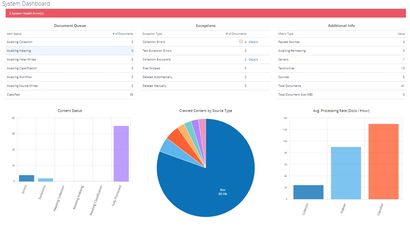
Dashboard view
The default screen shows a high-level overview of Netwrix Data Classification statistics, displaying the last active times of each service (with inactive services shown in red). Select the "i" icon next to each date to view the name of the active server as well as batch processing statistics. You will also view the processing throughput.
The following statistics are available for each thread type:
- Processing Time—The weighted average time for each thread (total batch time / number of documents processed)
- Real Execution Time—The actual execution time of each thread (average of each threads run time)
Statistics shown on the Dashboard screen are cached and updated regularly by the Collector service. If the values are not being updated please ensure that the Collector service is running.
New content will be shown as awaiting collection, and progress through to fully processed once it has been classified.
Content that has failed to process fully will be indicated under the "Exceptions" section, with the following meanings:
-
Collection Errors—Items that failed to process during collection (typically due to an error from the source system)
-
Text Extraction Errors—Items that failed text extraction (either partially or fully)—this will typically mean that the full text for the affected documents will not be available
-
Collection Exclusions—Items that have been excluded due to the specified configuration (such as Sources → SharePoint → Exclusions)
-
Files Skipped—File share items that have been ignored due to the "Files Included" or "Files Excluded" configuration (Sources → File)
-
Deleted Automatically—Items that have been detected as removed from the source system
-
Deleted Manually—Items removed manually by an end-user via the administration console
System Health
The health service provides a traffic light based reporting system. Colour-coded traffic lights will appear in the top menu bar when issues are detected. The traffic lights provide a quick link to this page to display more detailed information.
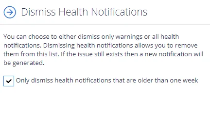
You will then see the list of reported issues, with the ability to view a detailed description of the problem and suggested resolution steps.
It is also possible to configure notifications of system issues, along with daily reports of outstanding system issues.
-
Click Dismiss at the bottom.
-
Select Only dismiss health notifications that are older than one week, if you do not want to be notified on outdated issues.
-
Select what you want to dismiss – warnings and all security notifications.
Netwrix Data Classification Service Viewer
From the Netwrix Data Classification Service Viewer it is possible to view a live stream of the current work being processed by the NDC services. As the services progress each document, the display will change. Once all work is complete, "Idle..." will be displayed.
This functionality may not work in older browsers. In this case the "on-server" application Netwrix Data Classification Service Viewer should be used.
Data Analysis
Data Analysis section in Netwrix Data Classification management console includes Reports and DSAR areas:
- To view reports on product operation, indexing and classification results, click Reports.
- To use DSAR search capabilities, click DSAR.
See next:
- Reporting
- Data Subject Access Requests
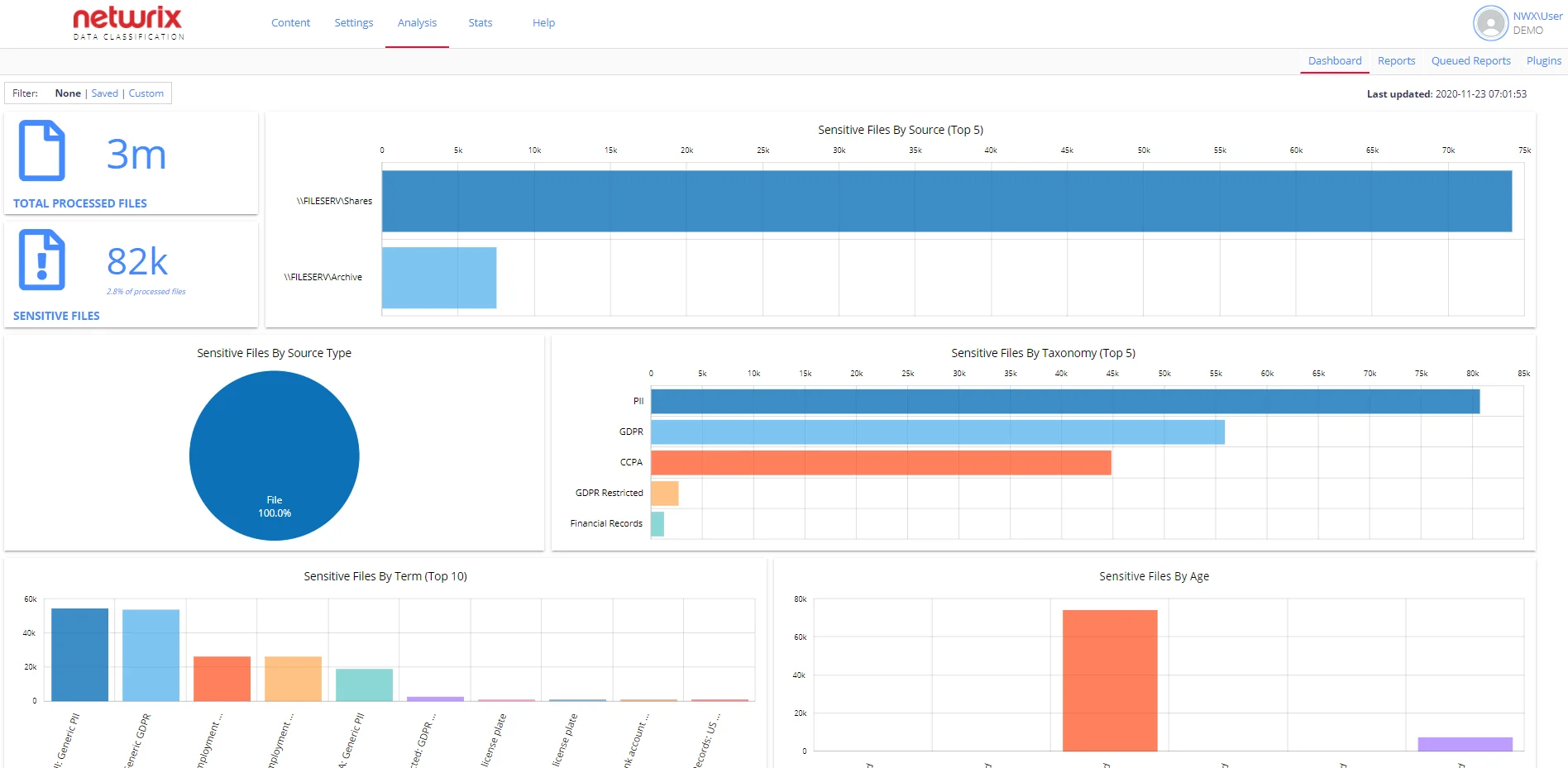
Sensitive Documents Dashboard
The dashboard provides a top-level overview of the security classifications tagged against the content and allows users to drill down into the data to gain visibility of where/what their sensitive content is. By default, the dashboard shows all classified data. However, users can customize it for their needs. See Customize Dashboard for more information.
NOTE: To review the dashboard a user requires the Access Reports permission and must have at least one Netwrix built-in taxonomy downloaded. See the following sections for more information:
The dashboard is the home page for the administrative web console.
If you want to switch to the dashboard page after doing any other tasks in the administrative web console, do the following:
-
Click the Netwrix Data Classification logo in the upper left corner.
OR
-
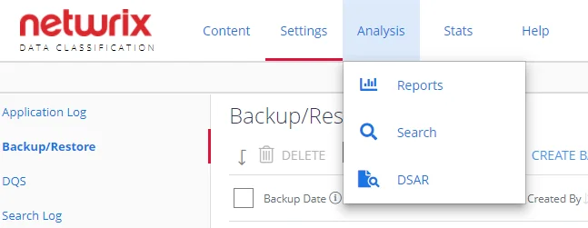
Locate the Data Analysis top level menu and select Reports:

-
Select the Dashboard tab on the left.
IMPORTANT! The data for the dashboard automatically updates every 15 minutes. Please note that refreshing the page will not update the data.
Review Sensitive Documents Dashboard
The dashboard includes the following sections:
-
Total processed files – shows the actual number of the classified files.
NOTE: Folders are not counted.
-
Sensitive Files – helps you identify how many files have been tagged at least once in any of Netwrix built-in sensitive taxonomies except for the following: File Type, File Size, Language. Review the Built-in Taxonomies Overview section for the full list of predefined taxonomies.
NOTE: Custom taxonomies are not counted.
-
Sensitive Files by Source (Top 5) – shows the top 5 sources that contain most of your sensitive data.
-
Sensitive Files by Source Type – shows sensitive content grouped by a source type. This pie chart contains all sources in the environment, instead of the previous one.
-
Sensitive Files by Taxonomy (Top 5) – shows the top 5 taxonomies that contain most of your sensitive data. Use this graph to discover why your data is sensitive. When you hover a taxonomy, the number of sensitive files is shown.
-
Sensitive Files by Term (Top 10) – shows the top 10 terms that have been tagged. Use this graph to see what sensitive data you have in more detail. When you hover a term, the number of sensitive files is shown.
-
Sensitive Files by Age – this graph is based on the last modified date of a file and can be used to see how old your sensitive documents are and how recently files are being changed.
TIP: Clicking any dashboard element opens a new tab with the Sensitive Documents report with the required filters. For example, clicking the Sensitive Files by Age graph opens the report with your sensitive files ordered with the oldest at the top. Use this report to discover where are your legacy documents reside. Besides, you can apply filters to narrow the reporting scope.
Customize Dashboard
By default, the dashboard shows all classified data in your environment. However, users can do one of the following to look after the desired metrics:
- Apply filters to view live data instantly and narrow classifications scope at a glance
- Save configurations to quickly access required data
To apply filters
-
Select Custom view in the upper left corner of the dashboard.

-
Select a taxonomy(-ies) and/or a source group(s) you want to see real-time data for.
-
Click Apply Filters to immediately review classified data matching your filtering criteria.
To save configuration
You can build up a few different dashboards for combinations of particular sources you are interested in or particular taxonomies and save this configuration to quickly access required data later.
-
Apply custom filters as described above.
-
Click Save Configuration.
To review saved configurations
- Switch to Saved view in the upper left corner of the dashboard.
- In the Load Saved Configurations list, select the required configuration.
This will then load you the latest version of that dashboard.