Admin Center
Authenticate with Authentication Types
To authenticate your identity store account in GroupID for multifactor authentication or second factor authentication, you must use one or more authentication types that you enrolled your account with.
What do you want to do?
- Authenticate using Security Questions
- Authenticate using Mobile
- Authenticate using Email
- Authenticate using Authenticator
- Authenticate using YubiKey
- Authenticate using Windows Hello
Authenticate using Security Questions
- When you launch Admin Center, the GroupID portal or the GroupID Mobile app, the GroupID Authenticate page is displayed.
- On signing in, enrolled users are redirected to the Authenticate page. This page lists the authentication types the user enrolled his or her account with.
- Select the Security Questions check box and click Continue.
- The next page lists the security questions you enrolled your account with. Provide answers to these questions.
- Click Verify and Continue.
Authenticate using Mobile
To authenticate using mobile, you have to enter the last 4 digits of the mobile number you provided during enrollment. GroupID sends a confirmation code to this number; you have to enter the code in GroupID for authentication.
To authenticate using mobile:
- When you launch Admin Center, the GroupID portal or the GroupID Mobile app, the GroupID Authenticate page is displayed.
- On signing in, enrolled users are redirected to the Authenticate page. This page lists the authentication types the user enrolled his or her account with.
- Select the Mobile Verification check box and click Continue.
- On the next page, type the last four digits of your mobile number and click Send Code.
- When the verification code is successfully sent to the provided mobile number, a box appears on the page. Enter the received code in it.
- Click Verify and Continue.
RECOMMENDED: If you do not receive the code, recheck your mobile number and click Send Again.
Authenticate using Email
To authenticate using Email, you have to complete the email address you provided during enrollment. GroupID then sends a confirmation code to this email address; you have to enter the code in GroupID for authentication.
To authenticate using email:
- When you launch Admin Center, the GroupID portal or the GroupID Mobile app, the GroupID Authenticate page is displayed.
- On signing in, enrolled users are redirected to the Authenticate page. This page lists the authentication types the user enrolled his or her account with.
- Select the Email Verification check box and click Continue.
- On the next page, complete your email address and click Send Code.
- When the verification code is successfully sent to the provided email address, a box appears on the page. Enter the received code in it.
- Click Verify and Continue.
RECOMMENDED: If you do not receive the code, recheck your email address and click Send Again.
Authenticate using Authenticator
- When you launch Admin Center, the GroupID portal or the GroupID Mobile app, the GroupID Authenticate page is displayed.
- On signing in, enrolled users are redirected to the Authenticate page. This page lists the authentication types the user enrolled his or her account with.
- Select the Authenticator check box and click Continue.
- Launch the Authenticator app on your smartphone.
- The app displays a 6-digit code. Enter it in the Security Code box on the Authenticator page.
- Click Verify and Continue.
Authenticate using YubiKey
- When you launch Admin Center, the GroupID portal or the GroupID Mobile app, the GroupID Authenticate page is displayed.
- On signing in, enrolled users are redirected to the Authenticate page. This page lists the authentication types the user enrolled his or her account with.
- Insert the YubiKey device in the USB slot of your computer.
- Select the YubiKey check box and click Continue.
- On the next page, click your YubiKey device name.
GroupID directs you to tap on the physical device. - On tapping, you are authenticated in GroupID.
Authenticate using Windows Hello
- When you launch Admin Center, the GroupID portal or the GroupID Mobile app, the GroupID Authenticate page is displayed.
- On signing in, enrolled users are redirected to the Authenticate page. This page lists the authentication types the user enrolled his or her account with.
- Select the Windows Hello check box and click Continue.
- On the next page, click Authenticate and Continue.
- Authenticate with the provided biometric information or with the PIN given in the Windows Hello sign-in options.
See Also
- Authentication Policy
- Enable Authentication Types
- Authentication Policy for Security Roles
- Enroll with Authentication Types
Enroll with Authentication Types
When the administrator has enabled multifactor authentication and second factor authentication for an identity store, users must enroll their identity store accounts in GroupID. Without enrolling, they will not be able to sign into GroupID.
To enroll, a user must register his or her identity store account in GroupID using one or more authentication types. When a user enrolls for multifactor authentication, it also suffices for second factor authentication, and vice versa. See the Authentication Policy topic for a list of supported authentication types.
Account enrollment is a one-time process. Enrolled users must authenticate their identity store accounts every time they have to pass multifactor or second factor authentication.
- For second factor authentication, a user must enroll his or her account with any one authentication type.
- For multifactor authentication, a user may have to enroll with more than one authentication type, depending on what the administrator has configured for a security role. See theEnforce Authentication Types for Multifactor Authentication topic.
What do you want to do?
- Enroll using Security Questions
- Enroll using Mobile
- Enroll using Email
- Enroll using Authenticator
- Enroll using YubiKey
- Enroll using Windows Hello
Enroll using Security Questions
To enroll your identity store account with the Security Questions authentication type, select a question and then provide an answer for it. The number of questions you must answer are configured by the administrator for your role. See the Define Security Question Settings for a Security Role topic.
To enroll with security questions:
- When you launch Admin Center, the GroupID portal or the GroupID Mobile app, the GroupID Authenticate page is displayed.
- On signing in, unenrolled users are redirected to the Your Enrollments page. Tabs on this
page represent the different authentication types the administrator has enabled for enrollment.
You can also launch the Your Enrollments page from Admin Center and the GroupID portal. See the Enroll your Account topic. - Click the Security Question tab.
- From a Question X list, select a security question of your choice (X represents the question
number).
You can also type a question in the box to create a new question of your choice. - Type your answer in the answer box.
- Repeat steps 4 and 5 to select another security question and provide an answer.
- Click Enroll Account.
A confirmation message is displayed on successful enrollment.
Enroll using Mobile
To enroll your identity store account using Mobile, you have to provide your mobile number. GroupID sends a verification code to this number via SMS and you have to enter it in GroupID to enroll successfully.
To draft the SMS message text, see the Link an SMS Gateway Account to an Identity Store topic.
To enroll using mobile:
- When you launch Admin Center, the GroupID portal or the GroupID Mobile app, the GroupID Authenticate page is displayed.
- On signing in, unenrolled users are redirected to the Your Enrollments page. Tabs on this
page represent the different authentication types the administrator has enabled for enrollment.
You can also launch the Your Enrollments page from Admin Center and the GroupID portal. See the Enroll your Account topic. - Click the Mobile tab.
- Select your country and then type your mobile number in the box.
- Click Send Code.
- When the verification code is successfully sent to the provided mobile number, a box appears on the page. Enter the received code in it.
- Click Enroll Account.
RECOMMENDED: If you do not receive the code, recheck your mobile number and click Send code again.
Enroll using Email
To enroll your identity store account using Email, you have to provide your email address. GroupID sends a verification code to this email address and you have to enter it in GroupID to enroll successfully.
To draft a subject line and body for the email, see the Modify the Email Template topic.
To enroll using email:
- When you launch Admin Center, the GroupID portal or the GroupID Mobile app, the GroupID Authenticate page is displayed.
- On signing in, unenrolled users are redirected to the Your Enrollments page. Tabs on this
page represent the different authentication types the administrator has enabled for enrollment.
You can also launch the Your Enrollments page from Admin Center and the GroupID portal. See the Enroll your Account topic. - Click the Email tab.
- Type your email address in the box and click Send verification code.
- When the verification code is successfully sent to the provided email address, a box appears on the page. Enter the received code in it.
- Click Enroll Account.
RECOMMENDED: If you do not receive the code, recheck your email address and click Send code again.
Enroll using Authenticator
Before you enroll with Authenticator, make sure you have installed an authenticator app, such as Google Authenticator or Microsoft Authenticator, on your phone.
To enroll with Authenticator:
- When you launch Admin Center, the GroupID portal or the GroupID Mobile app, the GroupID Authenticate page is displayed.
- On signing in, unenrolled users are redirected to the Your Enrollments page. Tabs on this
page represent the different authentication types the administrator has enabled for enrollment.
You can also launch the Your Enrollments page from Admin Center and the GroupID portal. See the Enroll your Account topic. - Click the Authenticator tab.
- Scan the QR code with the authenticator app installed on your smartphone.
The app generates a verification code and displays it on your phone’s screen. - Enter this code in the box on the Authenticator tab and click Enroll Account.
A confirmation message is displayed on successful enrollment.
Enroll using YubiKey
- When you launch Admin Center, the GroupID portal or the GroupID Mobile app, the GroupID Authenticate page is displayed.
- On signing in, unenrolled users are redirected to the Your Enrollments page. Tabs on this
page represent the different authentication types the administrator has enabled for enrollment.
You can also launch the Your Enrollments page from Admin Center and the GroupID portal. See the Enroll your Account topic. - Insert the YubiKey device in the USB slot of your computer.
- Click the YubiKey tab.
- Enter a name for your YubiKey device in the box.
- Click Enroll Account.
- You are directed to tap on the physical device. On tapping, your account gets enrolled.
Enroll using Windows Hello
Before enrolling your account with the Windows Hello authentication type, you must be registered on the device using the Windows Hello sign-in options.
GroupID allows enrollment on one Windows Hello device only.
To enroll using Windows Hello:
- When you launch Admin Center, the GroupID portal or the GroupID Mobile app, the GroupID Authenticate page is displayed.
- On signing in, unenrolled users are redirected to the Your Enrollments page. Tabs on this
page represent the different authentication types the administrator has enabled for enrollment.
You can also launch the Your Enrollments page from Admin Center and the GroupID portal. See the Enroll your Account topic. - Click the Windows Hello tab.
- Enter a name for your authentication device in the box and click Start Registration. You will be prompted to provide your biometric information using the configured biometric device.
See Also
- Authentication Policy
- Enable Authentication Types
- Authentication Policy for Security Roles
- Authenticate with Authentication Types
Access your Applications
GroupID users can have access to GroupID applications such as:
- Admin Center
- GroupID portals
- Third-party apps that GroupID services as an identity provider for single sign-on (SSO)
You can view a list of your applications and launch them from Admin Center without having to authenticate with a user name and password.
What do you want to do?
Access an Application
- In Admin Center, click your name in the top right corner and select My Applications.
- The GroupID Applications page displays the applications that you can access. Click an application to launch it.
Add a Third-party Application
GroupID can serve as an identity provider to facilitate SSO for third-party apps. You can add a third-party application as a service provider to authenticate its users through GroupID.
To add a third-party application:
- In Admin Center, click your name in the top right corner and select My Applications.
- Click Add Apps on the GroupID Applications page to add a third-party application. You are redirected to the Create Application page, where you can provide the details of the application you want to add as a service provider in GroupID. See the Register an Application (Service Provider) in GroupID topic.
Enroll your Account
- In Admin Center, click your name in the top right corner and select My Applications.
- Click Enroll your account on the GroupID Applications page to enroll the identity store account with which you are signed into Admin Center. See the Enroll with Authentication Types topic for enrollment details.
See Also
Change your Password
You can change the password of your identity store account. After changing it, use the new password to sign into GroupID and other applications that use your domain account.
What do you want to do?
- Change your Password
Change your Password
Follow the steps to change your password.
Step 1 – In Admin Center, click your name in the top right corner and select Change Password.
Step 2 – On the Change Password page, enter your current password in the Current Password box.
By default, password characters are represented by dots. Use the toggle button in the box to show or
hide characters.
Step 3 – Enter a new password in the New Password and Confirm Password boxes.
Step 4 – Click Change Password.
NOTE: Microsoft Entra ID users with multifactor authentication enabled cannot change their passwords in GroupID. The following message is displayed:.

If the user's account is a master account, password of its child accounts also cannot be changed in GroupID.
See Also
Group Management Concepts
To make the best of GroupID, you must be familiar with the following group management concepts:
Group Classification
Using GroupID, you can manage the following three kinds of groups:
Unmanaged Groups
An unmanaged group, also called a static group, is a group you normally create in a directory, for example, by using the Active Directory Users and Computers console. Though such groups can be created using the GroupID portal and Management Shell, GroupID does not support dynamic updates to them. Any changes to the membership have to be updated manually.
Smart Groups
A Smart Group is one that dynamically maintains its membership based on rules. These rules are applied in the form of a user-defined query, such as an LDAP query. This query is defined once and scheduled for membership update using a Smart Group Update schedule. When the schedule runs, it applies the defined rules to the directory and fetches matching records to update the group's memberships.
In this way, Smart Groups are automatically updated whenever the user information changes in the directory. This automated group management allows administrators to easily maintain large distribution lists and security groups without having to manually add or remove members.
Dynasties
A Dynasty is a Smart Group that creates and manages other Smart Groups using information in the directory. Dynasties help you manage large distribution lists by creating hierarchical group structures that represent your organization. The Smart Groups that the Dynasty creates are called child groups and become members of their respective parent Dynasty.
A Dynasty retrieves data from the directory on the same pattern as a Smart Group does, but it has its own mechanism of dividing the query results into child groups.
The Group-by Field Determines Child Groups
When you create a Dynasty, you specify a query and a field, referred to as the group-by field. The group-by field is used to divide the query results into groups.
For example, if you set ‘department’ as the group-by field, then each distinct value for the ‘department’ field is returned, for instance, Sales, Marketing, and Human Resources. Thus, a Dynasty with the group-by field set to ‘department’ creates child groups for each distinct value: Sales, Marketing, and Human Resources.
Built-in Updates
GroupID keeps the Dynasty active in two ways:
- By adding new child groups as new values are returned for the group-by field.
- By removing existing child groups as previous values of the group-by field no longer exist in the directory.
Thus, as new values of the ‘department’ field appear, new groups are created, and as old values disappear, the corresponding child groups are deleted.
The same process occurs with the membership of each child group. When a user’s department changes from Sales to Marketing, for example, the user is removed from the Sales child group and added to the Marketing child group.
The Parent-child Relationship
Dynasty children inherit their parent's characteristics and properties, such as group type, group security, expiry policy, owner, delivery restrictions, message size restrictions and more. Inheritance saves administrators incalculable time through the systematic application of predefined properties to new groups.
You can modify the values of all inherited attributes for a child, except the expiry policy. Child Dynasties always inherit the expiry policy from the parent Dynasty and it can only be modified at the parent level.
Dynasty Types
GroupID provides the following templates for creating Dynasties:
- Organizational - to create a Smart Group for every distinct company, then for each department within a company, and finally for each title in a department.
- Geographical - to create a Smart Group for every distinct country, then for each state within a country, and finally for each city within a state.
- Managerial - to either create separate Smart Groups for the direct reports of each manager or add all direct reports of the top manager and sub-level managers to a single group.
- Custom - to begin with a blank Dynasty and select your own group-by attributes.
These templates provide predefined group-by attributes for creating Dynasty levels. You can also define custom group-by attributes to expand the Dynasty levels to suit your organizational model. You can also combine an external data source with the templates to provide extended criteria for determining group membership.
Group Types
Groups fall into two functional categories: distribution groups and security groups.
Distribution Groups
Distribution groups, also called distribution lists, are designed to combine users together so that you can send emails (via a mail server) to a group rather than individually to each user in the group.
Distribution groups can be used only with email applications, such as Microsoft Exchange. These groups are not security-enabled, which means that they cannot be listed in discretionary access control lists (DACLs). If you need a group for controlling access to shared resources, create a security group.
Security Groups
Security groups provide an efficient way to assign access to resources on your network. Using security groups, you can:
- Assign user rights - User rights are assigned to security groups to determine what members of that group can do within the scope of a domain (or forest). For example, a user who is added to the Backup Operators group can back-up and restore files and directories located on each domain controller in the domain. By being a member of this group, you inherit the user rights assigned to the group.
- Assign permissions to resources- This is different from user rights because user rights apply across an entire domain versus permissions that are directed to a specific entity. Permissions determine who can access the resource and the level of access, such as Full Control or Read-only.
Security groups can also be used as a distribution group in Exchange. These are known as security-enabled distribution groups.
Group Scope
Groups are characterized by a scope that identifies the extent to which the group is applied in a domain or forest. The boundary, or reach, of a group scope is also determined by the domain functional level of the domain in which it resides.
A group’s scope determines:
- the domains from where members can be added to the group
- the domains where the group can be used to grant permissions
- the domains where the group can be nested in other groups
A group can be of universal, global, or domain local scope.
Universal
Use groups with universal scope to consolidate groups that span domains. To do this, add the accounts to groups with global scope, and then nest these groups within groups that have universal scope. When you use this strategy, any membership changes in the groups that have global scope do not affect the groups with universal scope.
Do not change the membership of a group with universal scope frequently, because membership changes cause the entire membership of the group to be replicated to every global catalog in the forest.
Global
Use groups with global scope to manage directory objects that require daily maintenance, such as user and computer accounts. Because groups with global scope are not replicated outside their own domain, you can change accounts in a group having global scope frequently without generating replication traffic to the global catalog.
As a best practice, you should use global groups or universal groups rather than domain local groups when you specify permissions on domain directory objects that are replicated to the global catalog.
A global group can contain users, computers, and groups from the same domain but not universal groups.
Domain Local
Groups with domain local scope help you define and manage access to resources within a single domain. For example, to give five users access to a printer, you can add all five user accounts in the printer permissions list.
A domain local group can contain users, computers, global groups, and universal groups from any domain in the forest and any trusted domain, as well as domain local groups from the same domain. Such a group can be a member of any domain local group in the same domain.
Group Security Types
A group’s security type determines how non-members can access the group and become its members. GroupID provides three security types:
- Private - to restrict access to the group to members selected by the group owner. Only the owner can add or remove members from the group. Requests to join or leave the group cannot be submitted.
- Semi-Private - to restrict access to the group to members selected by the group owner. However, requests to join or leave the group can be sent to the owner.
- Public - to allow all users to access the group. Users can join or leave the group at will and do not require any permissions to do so. The administrator can configure email notifications to be sent to the group owner when a user joins or leaves the group.
See Also
Dashboard
The Admin Center dashboard is a data visualization tool that displays widgets for performance analytics, alerts, and reporting on GroupID and identity stores on a single page.
In Admin Center, click Dashboard in the left pane. The dashboard displays the following cards with aggregated data from all identity stores built on Active Directory, Microsoft Entra ID, Google Workspace, and Generic LDAP, as well as individual identity stores.
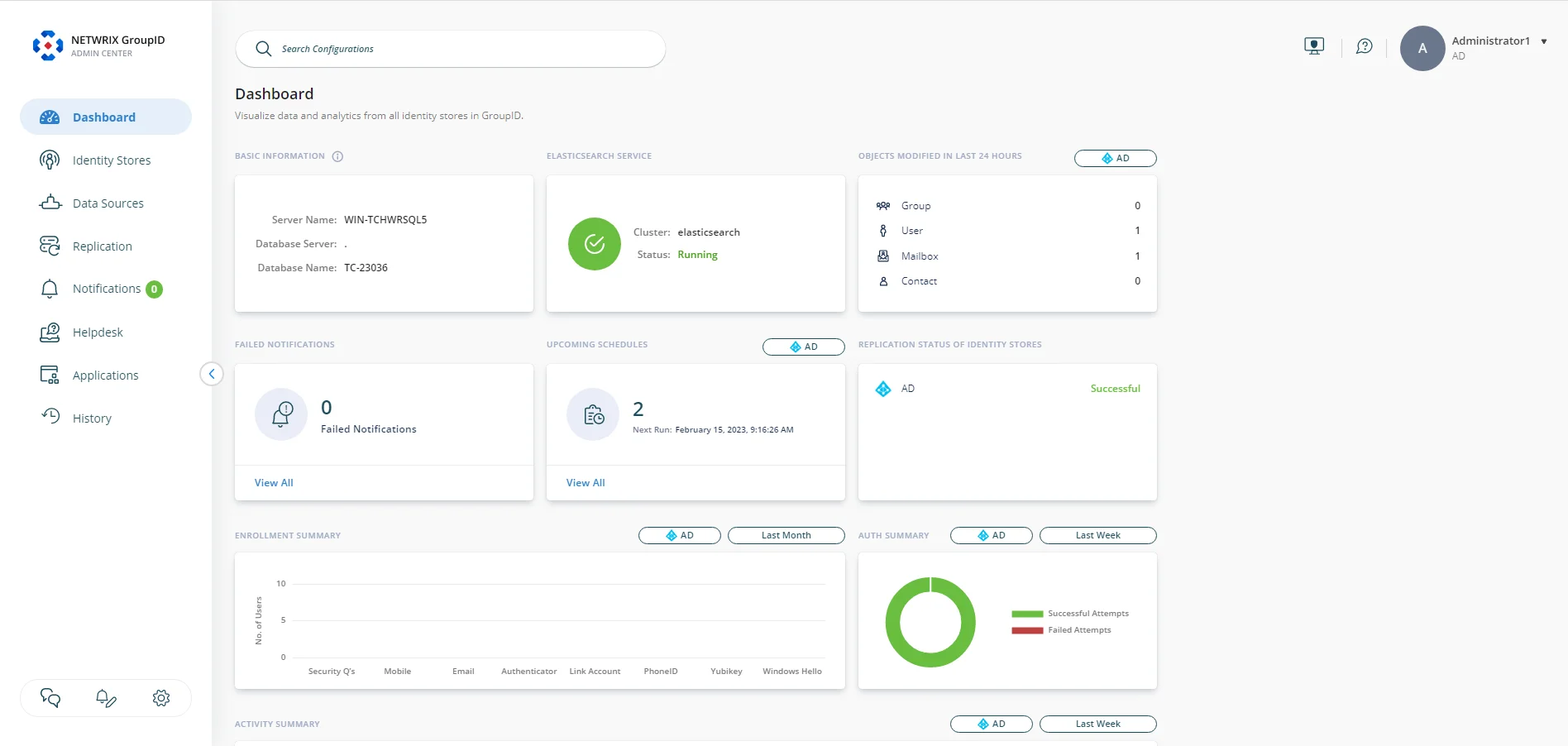
The dashboard displays the following information:
- Basic Information
- Elasticsearch Service
- Objects Modified in Last 24 Hours
- Failed Notifications
- Upcoming Schedules
- Replication Status of Identity Stores
- Enrollment Summary
- Auth Summary
- Activity Summary
Basic Information
This card displays the following information:
- Server Name: The name of the GroupID server machine.
- Database Server: The name of the SQL server machine hosting the GroupID database.
- Database Name: The name of the GroupID database.
Elasticsearch Service
This card displays the following information about the Elasticsearch service:
-
Cluster: The name of the Elastic cluster the GroupID Elasticsearch node is joined to.
-
Elasticsearch service status, which can be:
- Running - indicates that the service is up and running.
- Stopped - indicates that the GroupID Elasticsearch node has run into issues. You must troubleshoot it for GroupID to work.
Objects Modified in Last 24 Hours
This card displays the number of users, groups, mailboxes, and contacts modified in the directory during the last 24 hours. This count represents the modifications done using GroupID and directly in the directory.
Information is displayed individually for each identity store. Select an identity store from the list next to the card name to view the data for it.
Failed Notifications
This card displays the count for failed notifications, i.e., the GroupID-generated notifications that could not be delivered for any reason, such as when the SMTP server is down or the recipient’s address is incorrect.
Click View All to go to the Notification Queue page, where you can view the failed notifications in detail. See the Manage the Notification Queue topic.
Upcoming Schedules
Multiple schedules can be defined for an identity store. This card displays the number of schedules that will run in the next 24 hours. The card also displays the data and time the next schedule will run.
You can:
- View the details of upcoming schedules for all identity stores in GroupID.
- View the details of upcoming schedules for an identity store individually.
Select an identity store from the list next to the card name to view the upcoming schedules for it or select All Identity Stores to view the upcoming schedules for all identity stores.
Click View All to view a list of the upcoming schedules with their names, the next date and time of schedule run, and the identity store they belong to.

Replication Status of Identity Stores
This card lists the identity stores for Active Directory, Microsoft Entra ID, Google Workspace, and Generic LDAP defined in GroupID, along with their replication status, which can be:
- Successful: Indicates that identity store objects are successfully replicated.
- Failed: Indicates that identity store objects have failed to replicate either because the Replication service did not run as scheduled or an error occurred during replication.
- Never Replicated: Indicates that the identity store is never replicated.
Enrollment Summary
This card employs a bar graph to display the enrollment stats and trends for an identity store. It shows the number of user accounts enrolled using each of the authentication types (including accounts enrolled by end-users and by helpdesk for end-users).
Consider the following:
- You can view enrollment data for an identity store individually or view aggregated data for all identity stores in GroupID. Select an identity store from the list next to the card name to view the enrollment data for it or select All Identity Stores to view the data for all identity stores.
- Hover the mouse over a bar to view the number of users enrolled with the specific authentication type. Click a bar to launch the Helpdesk page, that displays a list of users enrolled with that authentication type. See the View Users' Information topic for details on the information displayed for a user. (Notice that the Filter(s) dialog box displays the selected authentication type in the Enrolled With box.)
- By default, data is displayed for the last one month. You can view enrollment data for any specific period. Click the tile showing the time period to launch the calendar. Use it to specify a date range to view the data.
Auth Summary
This card employs a pie chart to display the authentication stats and trends for an identity store, i.e., the number of successful and failed authentication attempts made by identity store users in GroupID. Information is based on:
- Authentication attempts made using authentication types for second factor authentication.
- Authentication attempts made using authentication types for multifactor authentication.
- Sign in attempts made using username and password.
The pie chart is highly interactive. You can:
- Hover the mouse over an arc to view the successful or failed authentication attempt count.
- Click the arc for successful or failed attempts to view successful/failed authentication attempts for each authentication type. Another pie chart appears to display the authentication types used in the authentication attempt. Click this chart to navigate to the History tab of the Helpdesk page to view the logged history for the authentication attempts with the respective authentication type. See the History in Helpdesk topic.
Consider the following:
- You can view authentication data for an identity store individually or view aggregated data for all identity stores in GroupID. Select an identity store from the list next to the card name to view the auth data for it or select All Identity Stores to view the data for all identity stores.
- By default, data is displayed for the last one week. You can view authentication data for any specific period. Click the tile showing the time period to launch the calendar. Use it to specify a date range to view the data.
See the Authentication Policy topic for a list of supported authentication types.
Activity Summary
This card employs a bar graph to display the number of times the following activities were performed in an identity store by both helpdesk and end-users:
- Password change
- Password reset
- Account unlock
- Link account
- Unlink account
- Enroll account
Consider the following:
- You can view data for these activities for an identity store individually or view aggregated data for all identity stores in GroupID. Select an identity store from the list next to the card name to view the activity summary for it or select All Identity Stores to view the data for all identity stores.
- To view a list of users who used a function on a particular date, click the relevant data point on the function line. A list of users is displayed on the History tab of the Helpdesk page. See the History in Helpdesk topic. (Notice that the Filter(s) dialog box displays the selected function in the Action Type box.)
- By default, data is displayed for the last one week. You can view activity summary for any specific period. Click the tile showing the time period to launch the calendar. Use it to specify a date range to view the data.
- By default, data for all the activities is displayed. Click an activity name at the bottom of the graph to hide its data. The name is struck out, indicating that data for the activity is not depicted on the graph. Click the activity name again to display its data on the graph.
See Also
Manage the Global Question Pool
GroupID provides a list of predefined security questions for enrollment and authentication. You can update this list by adding or removing questions.
When an identity store is created, four questions from this global pool are automatically added to the identity store's local question pool. This pool is not shared with other identity stores.
What do you want to do?
Add a Question to the Question Pool
- In Admin Center, click Settings at the bottom of the left navigation pane.
- On the GroupID Settings page, click the Question Pool tab.
- To add a question, click Add New Question.
- On the Add New Question dialog box, type a security question in the Question box and click Add Question."The new question is displayed on the Question Pool tab. Questions are sorted in alphabetical order.
Search a question in the list:
To search for a security question in the list, enter a search string in the search box and press Enter. Questions that contain the string will be filtered.
Remove a Question from the Question Pool
- In Admin Center, click Settings at the bottom of the left navigation pane.
- On the GroupID Settings page, click the Question Pool tab.
- On the Question Pool tab, click Delete for a question to delete it.
- Click Delete on the Delete Question dialog box.
Deleting a question does not impact the users currently enrolled with the question.
See Also
Admin Center History
GroupID auto tracks the following actions performed in Admin Center:
- Creation and deletion of identity store
- Creation and deletion of SMS gateway accounts
- Creation and deletion of applications, namely GroupID portal, Mobile service, Data service, and Security service
- Addition and removal of security questions in the global question pool
- Changes to global replication settings
- Manual sending and deletion of notifications in the notification queue
- Modifications to notification templates
History can be viewed using the History node in Admin Center. You can:
- Annotate a history action that you have performed. These annotations may explain the reason for performing an action.
- Narrow down the history items using filters.
- Export history data to Microsoft Excel, CSV, and XML formats.
What do you want to do?
View Admin Center History
You can view the history data that GroupID auto tracks for high level actions performed in Admin Center.
To view history:
- In Admin Center, click History in the left pane.
The Admin Center History page displays history data in a descriptive, concise, and user-friendly manner. Items are sorted according to the date and time, with the most recent at the top. - Click a history item to view its details. The History Details dialog box displays the
following:
- Object Name: The name of the object the action was performed on.
- Who: The name of the user who performed the action.
- Where: The name of the computer the action was performed on.
- When: The date and time of the action.
- Added Item(s): A short description of the action.
- Removed Item(s): This box is displayed for actions showing deletion. It displays a short description of the action.
- The Add Note button is available if you performed this action. See Annotate History Items to manage notes.
- Click Close.
Filter History Data
Filters on the Admin Center History page are similar to those on the Identity Store History page. Refer to the Filter History Data topic to apply the filters.
Navigate the History Data
Navigation options on the Admin Center History page are similar to those on the Identity Store History page. Refer to the Navigate Through History Items topic for help.
Annotate History Items
- In Admin Center, click History in the left pane.
- On the Admin Center History page, click a history item and proceed to add a note. See the Annotate History Items topic for details.
Export Admin Center History
You can export Admin Center history to Microsoft Excel, CSV, and XML formats.
To export history:
- In Admin Center, click History in the left pane.
- On the Admin Center History page, click Export History.
- On the Export History dialog box, enter a name for the history file in the Name box or leave it to default.
- Select a format for the history file in the Format drop-down list. Available formats are Excel, CSV, and XML
- Click Export History. The file is saved at the download location specified in browser settings.
- A message is displayed that history data is successfully exported. Click OK.
See Also
License GroupID
You can license GroupID under one or more of these license types:
-
Suite - enables access to all GroupID functionality and its clients, including the GroupID portal, mobile app, Management Shell, and APIs.
-
Group Management - enables access to all the group management features in GroupID, except those licensed under add-ons.
-
User Management - enables access to all the user management features in GroupID, except those licensed under add-ons.
-
Password Management - enables access to password management functions in GroupID, that are:
- Account unlock and password reset by both end users and helpdesk
- Multifactor authentication
- Second way authentication
-
Add-ons - licenses for the following add-ons are available:
-
API - separate licenses are required for user-specific and group-specific APIs.
-
Workflow - enables you to create new workflows, update existing workflows, specify a default approver, and delete workflow requests. Separate licenses are required for user-specific and group-specific workflows.
-
Workflow Acceleration - enables you to use the workflow approver acceleration function. Separate licenses are required to accelerate user-specific and group-specific workflows.
-
Management Shell - separate licenses are required for user-specific and group-specific cmdlets.
-
Entitlement - separate licenses are required to manage entitlements for users and groups.
-
Synchronize Jobs - separate licenses are required for user-specific and group-specific Synchronize jobs.
-
Group Lifecycle - required to run the Group Lifecycle schedule in the identity stores.
-
Dynamic Groups - required to create and manage Smart Groups and Dynasties in GroupID.
-
Power Automate - enables you to integrate GroupID workflows with Power Automate flows. Separate licenses are required for integrating user-specific and group-specific workflows.
-
Group Usage Service - required to run the Group Usage Service schedule in the identity stores.
-
Group Attestation - required to enable the group attestation function in the identity stores.
-
Linked Identity Stores - required to manage identical user objects and identical group objects in the identity store(s). It works as follows with other GroupID licenses:
- Suite License: enables the linked identity stores feature fully functional. You can manage your linked identities. In case of an Active Directory identity store and Microsoft Entra ID identity store link, you can manage entitlements of File Servers and SharePoint sites also.
- Group Management license: enables you to manage identical groups in the linked identity store(s) and auto sync them.
- User Management license: enables you to manage identical user objects in the linked identity store(s) and auto sync them.
- Password Management license: the linked identity stores feature works in preview mode.
-
A license is valid for a period of 12 months.
NOTE: All the above licenses are also available for a trial period.
NOTE: Licenses for certain add-ons are dependent on other licenses, such as the Group Attestation license is dependent on the Group Usage Service license, which in turn is dependent on the Group Management license.
What happens when your license expires
When a license expires, its respective functions get read-only but you can configure certain settings, such as create identity stores, create data sources, and define replication settings. Moreover, unlicensed functions are displayed with a yellow icon next to them. On hovering the mouse over the icon, a message is displayed with two buttons: Learn more and Upgrade. Both buttons redirect you to the Group and User Management Software from Netwrix page, where you can learn more about GroupID and purchase or renew your GroupID licenses.
What do you want to do?
Add a License
-
In Admin Center, click Settings at the bottom of the left navigation pane.
-
On the Licensing Settings tab of the GroupID Settings page, click Add New License.
-
Enter a valid license number and key for your product copy in the respective boxes. A valid license and key enable the Add License button; if it remains disabled, check your entries for errors.
-
Click Add License.
License details are displayed on the Licensing Settings tab as:
- Status: the license status as Valid or Expired
- Module: the license type, such as Suite or Group Management
- Expire: the expiration date of the license
- License(s): the number of users covered under the license
- Actions: displays the Edit and Delete icons, enabling you to update or remove the license accordingly.
-
If you have multiple GroupID licenses, repeat steps 2 – 4 for each license.
Update a License
- In Admin Center, click Settings at the bottom of the left navigation pane.
- On the Licensing Settings tab of the GroupID Settings page, click Edit for a license in the Actions column to update it.
- On the Update/Replace License dialog box, update the license number and key.
- Click Update to save the changes.
Remove a License
On removing a license, users lose all access to the functionality covered under the license.
NOTE: A dependent license is rendered ineffective when you remove its parent license.
To remove a license:
- In Admin Center, click Settings at the bottom of the left navigation pane.
- On the Licensing Settings tab of the GroupID Settings page, click Delete for a license in the Actions column to remove it.
Get Logs
GroupID generates logs for its services, clients, and Windows events, which are saved at different locations on the network. Rather than locating these log files in their respective folders, you can collect and dump your required logs to a desired location.
What do you want to do?
Get Log Files
- In Admin Center, click Settings at the bottom of the left navigation pane.
- On the GroupID Settings page, click the Logs tab.
- On the Logs tab:
-
On the Applications card, select the check boxes for the GroupID services and portals that you want to fetch the logs for. To select all options, select the Select All check box on the card.
Each application has a file logging level set for it. Log files generated against file logging will be fetched.- For applications deployed in native IIS, logs will be fetched from the GroupID server.
- For applications deployed in remote IIS, logs will be fetched from the remote IS machine.
- For applications deployed in Docker, logs will be fetched from the machine running Docker daemon.
-
On the Tools & Management Shell card, select the check boxes for Management Shell and the GroupID tools that you want to fetch the logs for. To select all options, select the Select All check box on the card. Logs will be fetched from the local machine. If you have not used Management Shell or a tool on the machine, its respective logs will not be available.
-
On selecting the Event Viewer check box on the Event Viewer card, the Logs button is enabled. Click it to launch the Select Event Viewer Logs dialog box, that displays all logs maintained by Windows Event Viewer on the local machine. Select the check boxes for the required logs and click OK.
- Click Download.
GroupID creates a zipped file containing the selected logs and saves it to the download location set in browser settings.
See Also
- Event Logging
- For a Portal - Manage Log Settings
Switch Accounts
You do not need to sign out of Admin Center in order to sign in with a different account. Simply use the switch account function to achieve this.
What do you want to do?
Switch your Account
- In Admin Center, click your name in the top right corner and select Switch Account. The next page lists the accounts you have used to sign into Admin Center and the GroupID portal.
- Do one of the following:
- Click an account to access Admin Center with it, without having to provide the password.
- Click Login as a different user to sign in with an account not listed on this page.
- Click Logout completely to sign out of all the accounts listed on this page.
See Also
GroupID Applications
Using Admin Center, you can create and manage the following GroupID applications:
Moreover, you can manage some basic deployment and log settings for the following applications:
See Also
Manage the Bad Words List
GroupID enables you to restrict portal users from saving data containing words that might be offensive. You can maintain a list of undesired words for a portal. When a user enters a value that contains a word on the list, the portal does not save the entry until the word is removed or corrected.
The bad words check applies to the following:
- Fields with the ‘Filter Bad Words’ option enabled in field properties
- History notes that a user enters for a logged history action
What do you want to do?
- Add a Bad Word to the List
- Update a Bad Word
- Remove a Bad Word from the List
- Enable/Disable the Bad Words Check
Add a Bad Word to the List
- In Admin Center, select Applications in the left pane.
On the GroupID Portal tab, a portal's card displays its info. - Click the ellipsis button for a portal and select Settings.
- Select an identity store under Design Settings to customize the portal for it.
All identity stores linked with the portal are listed under Design Settings. You can design a different portal for each of these. - Click Bad Words List in the left pane.
- On the Bad Words List page, click Add.
- In the Value box on the New Bad Word dialog box, enter a word that you want to prevent
users from typing in the portal and click OK.
The bad word is displayed in the Name list on the Bad Words List page. - Make sure to enable the toggle button at the top of the page to apply the bad words filter to the portal.
- Click Save.
Update a Bad Word
- In Admin Center, select Applications in the left pane.
On the GroupID Portal tab, a portal's card displays its info. - Click the ellipsis button for a portal and select Settings.
- Select an identity store under Design Settings to customize the portal for it.
All identity stores linked with the portal are listed under Design Settings. You can design a different portal for each of these. - Click Bad Words List in the left pane.
- On the Bad Words List page, click Edit for a bad word.
- On the Edit Bad Word dialog box, update the bad word and click OK.
- Click Save on the Bad Words List page.
Remove a Bad Word from the List
- In Admin Center, select Applications in the left pane.
On the GroupID Portal tab, a portal's card displays its info. - Click the ellipsis button for a portal and select Settings.
- Select an identity store under Design Settings to customize the portal for it.
All identity stores linked with the portal are listed under Design Settings. You can design a different portal for each of these. - Click Bad Words List in the left pane.
- On the Bad Words List page, click Remove for a bad word to remove it.
- Click Save.
Enable/Disable the Bad Words Check
- In Admin Center, select Applications in the left pane.
On the GroupID Portal tab, a portal's card displays its info. - Click the ellipsis button for a portal and select Settings.
- Select an identity store under Design Settings to customize the portal for it.
All identity stores linked with the portal are listed under Design Settings. You can design a different portal for each of these. - Click Bad Words List in the left pane.
- On the Bad Words List page, disable the toggle button at the top of the page to disable the
bad word check in the portal.
You can apply the check any time by enabling the toggle button. - Click Save.
See Also
Customize the Create Object Wizards
Using a portal, users can create different directory objects, namely:
- User
- Mailbox
- Contact
- Static Group
- Smart Group
- Organizational Dynasty
- Geographical Dynasty
- Managerial Dynasty
- Custom Dynasty
The portal provides a separate wizard for creating each of these objects. You can customize a wizard as needed.
NOTE: In the portal, the Create Group wizard starts with the Group Type page, where users can select the type of group they want to create. Options on this page vary, depending on the permissions assigned to the user in the identity store. (See the Security Role – Permissions topic.)
- If a user has the Create Static Group permission and is denied the Create Smart Group permission, only the Static Group option is displayed on the Group Type page.
- If a user has the Create Smart Group permission and is denied the Create Static Group
permission, all options except Static Group are displayed on the Group Type page.

NOTE: You can customize the Group Type page individually for static group, Smart Group, and each of the Dynasty types. However:
- If a user has permissions to create both static groups and Smart Groups, the Group Type page created for Static Group would be displayed to the user in the portal.
- If a user does not have permission to create static groups, but has permission to create Smart Groups, the Group Type page created for Smart Group would be displayed to the user in the portal for Smart Groups and Dynasties.
What do you want to do?
- Add a Page to a Wizard
- Update a Wizard Page
- Rearrange the Pages on a Wizard
- Remove a Page from a Wizard
- Add a Field to a Wizard Page
- Update a Field
- Rearrange the Fields on a Wizard Page
- Remove a Field from a Wizard Page
Add a Page to a Wizard
- In Admin Center, select Applications in the left pane.
On the GroupID Portal tab, a portal's card displays its info. - Click the ellipsis button for a portal and select Settings.
- Select an identity store under Design Settings to customize the portal for it.
All identity stores linked with the portal are listed under Design Settings. You can design a different portal for each of these. - Click Create Object in the left pane. The Create Object page is displayed.
- In the Select Directory Object drop-down list, select a directory object.
The Name list displays the pages on the object’s creation wizard. - Click Add. The Add Category pane is displayed.
- In the Name box, enter a name for the page. The page will be displayed in the wizard with this name.
- In the Visibility Level drop-down list, select a security role. The page would be visible to
users of this role and roles with a priority value higher than this role. See
Priority.
Select Never to hide the page from all users. - To add fields to the page, see the Add a Field to a Wizard Page topic.
- Click OK.
- Click Save on the Create Object page.
Update a Wizard Page
You can update the following for a page:
- Name
- Visibility level
To update a wizard page:
- In Admin Center, select Applications in the left pane.
On the GroupID Portal tab, a portal's card displays its info. - Click the ellipsis button for a portal and select Settings.
- Select an identity store under Design Settings to customize the portal for it.
All identity stores linked with the portal are listed under Design Settings. You can design a different portal for each of these. - Click Create Object in the left pane.
- On the Create Object page, select a directory object in the Select Directory Object drop-down list.
- In the Name list, click Edit for a page.
- On the Edit Category pane, update the name and visibility level for the page. Follow steps 7-11 in the Add a Page to a Wizard topic for details.
Rearrange the Pages on a Wizard
- In Admin Center, select Applications in the left pane.
On the GroupID Portal tab, a portal's card displays its info. - Click the ellipsis button for a portal and select Settings.
- Select an identity store under Design Settings to customize the portal for it.
All identity stores linked with the portal are listed under Design Settings. You can design a different portal for each of these. - Click Create Object in the left pane.
- On the Create Object page, select a directory object in the Select Directory Object
drop-down list.
The Name list displays the pages on the object’s creation wizard. - To change the order that pages are displayed on the wizard, click the equal sign for a page and drag to change its position.
- Click Save.
Remove a Page from a Wizard
- In Admin Center, select Applications in the left pane.
On the GroupID Portal tab, a portal's card displays its info. - Click the ellipsis button for a portal and select Settings.
- Select an identity store under Design Settings to customize the portal for it.
All identity stores linked with the portal are listed under Design Settings. You can design a different portal for each of these. - Click Create Object in the left pane.
- On the Create Object page, select a directory object in the Select Directory Object
drop-down list.
The Name list displays the pages on the object’s creation wizard. - Click Remove for a page to remove it.
- Click Save.
Add a Field to a Wizard Page
-
In Admin Center, select Applications in the left pane.
On the GroupID Portal tab, a portal's card displays its info. -
Click the ellipsis button for a portal and select Settings.
-
Select an identity store under Design Settings to customize the portal for it.
All identity stores linked with the portal are listed under Design Settings. You can design a different portal for each of these. -
Click Create Object in the left pane.
-
On the Create Object page, select a directory object in the Select Directory Object drop-down list.
The Name list displays the pages on the object’s creation wizard. -
Click Edit for the page you want to add a field to.
-
On the Edit Category pane, click **Add Field.**The Add Field pane is displayed.
-
In the Field drop-down list, select a schema attribute to link to this field.
-
In the Display Name box, enter a display name for the field. This name is the field’s label on the wizard.
-
In the Display Type drop-down list, select a display type to use for rendering this field on the wizard.
The list contains basic display types and custom display types defined on the Custom Display Types page. See the Display Type Categories topic. -
In the Visibility Level drop-down list, select a security role. The field would be visible to users of the selected role and roles with a priority value higher than the selected role. See Priority.
Select Never to hide the field from all users. -
As mentioned for visibility level, the field is visible to members of the selected role and roles with a priority value higher than the selected role.
In the Exclude Roles area, select the check boxes for the higher priority role(s) you want to hide the field from. -
In the Tooltip Text box, enter the text to display when a user hovers the mouse over the field.
-
In the Max Length box, enter a number that represents the maximum number of characters that users can enter as value for this field.
Entering 0 indicates that users can enter an unlimited number of characters as value. -
Use the Search Object Types area to specify the object types (User, Contact, and/or Group) that can be searched on the portal’s Find dialog box, to set as value for the field.
The following display types support the Find dialog box:- DN
- DNs
- Custom display types created with the Grid type
When you select any of these display types, GroupID identifies that the value for the field has to be searched using the Find dialog box. The Search Object Types area is displayed, where you can select the required object type(s). For example, if you select Group, only groups can be searched and selected as value for the field.
You can launch the Find dialog box from multiple portal pages to search for objects to designate as owners, managers, additional owners, members, and more. While specifying the searchable object type(s), you must be aware of the kind of value the field requires. -
In the Default Value box, enter the default value that would be displayed in the field on the portal.
Users can update this value, provided that the Is Read Only check box is not selected. -
Select the Is Required check box to make it mandatory for users to provide a value for the field.
-
Select the Is Read Only check box to make the field read-only.
-
Select the Filter Bad Words check box to ensure that users do not enter any bad word in this field.
A value entered for the field is checked against the words listed on the Bad Words List page. Matched values cannot be saved. See the Manage the Bad Words List topic. -
Click OK. The field is displayed in the Fields area on the Edit Category pane. You can rearrange the fields, update field properties, and even remove a field from the wizard page.
-
Click OK.
-
Click Save on the Create Object page.
Update a Field
You can change the following for a field:
- The name of the field (this is the field label in the portal)
- The schema attribute linked with the field
- The display type used to render the field in the portal
- Visibility level
- Tooltip
The following field properties vary from field to field. You can:
- Set a default value for the field
- Specify the maximum characters that a user can enter as value for the field
- Make the field editable or read–only
- Prevent users from using certain words as value for the field
- Make it optional or mandatory for users to provide a value for the field
- For search fields, you can specify the object types (groups, users, contacts) that can be searched and set as field value
To update field properties:
- In Admin Center, select Applications in the left pane.
On the GroupID Portal tab, a portal's card displays its info. - Click the ellipsis button for a portal and select Settings.
- Select an identity store under Design Settings to customize the portal for it.
All identity stores linked with the portal are listed under Design Settings. You can design a different portal for each of these. - Click Create Object in the left pane.
- On the Create Object page, select a directory object in the Select Directory Object
drop-down list.
The Name list displays the pages on the object’s creation wizard. - Click Edit for the page you want to edit a field for.
- On the Edit Category pane, click Edit for a field to update its properties.
- The Edit Field pane is displayed. Follow steps 8-22 in the Add a Field to a Wizard Page topic to update and save the information.
Rearrange the Fields on a Wizard Page
- In Admin Center, select Applications in the left pane.
On the GroupID Portal tab, a portal's card displays its info. - Click the ellipsis button for a portal and select Settings.
- Select an identity store under Design Settings to customize the portal for it.
All identity stores linked with the portal are listed under Design Settings. You can design a different portal for each of these. - Click Create Object in the left pane.
- On the Create Object page, select a directory object in the Select Directory Object
drop-down list.
The Name list displays the pages on the object’s creation wizard. - Click Edit for the page you want to rearrange the fields for.
- On the Edit Category pane, the fields on the wizard page are listed in the Fields area.
To rearrange the fields on the page, click the equal sign for a field and drag to change its position. - Click OK.
- Click Save on the Create Object page.
Remove a Field from a Wizard Page
- In Admin Center, select Applications in the left pane.
On the GroupID Portal tab, a portal's card displays its info. - Click the ellipsis button for a portal and select Settings.
- Select an identity store under Design Settings to customize the portal for it.
All identity stores linked with the portal are listed under Design Settings. You can design a different portal for each of these. - Click Create Object in the left pane.
- On the Create Object page, select a directory object in the Select Directory Object
drop-down list.
The Name list displays the pages on the object’s creation wizard. - Click Edit for the page you want to remove a field from.
- On the Edit Category pane, the fields on the wizard page are listed in the Fields area.
Click Remove for a field to remove it. - Click OK.
- Click Save on the Create Object page.
See Also
Customize Quick Search
In a GroupID portal, the quick search box is available at the top of each page. You can specify the schema attributes that quick search runs on, and the objects (group, user, contact) that can be searched. When a user enters a search string, the values of all specified attributes are matched to return the results (allowed objects).
You can also specify a search operator that determines what part of the attribute value should match the search string.
What do you want to do?
Specify Attributes for Quick Search
- In Admin Center, select Applications in the left pane.
On the GroupID Portal tab, a portal's card displays its info. - Click the ellipsis button for a portal and select Settings.
- Select an identity store under Design Settings to customize the portal for it.
All identity stores linked with the portal are listed under Design Settings. You can design a different portal for each of these. - Click Search Forms in the left pane. Then click the Quick Search Attributes tab.
- On the Quick Search Attributes tab, the Name column lists the schema attributes whose
values will be matched when portal users perform a search using the quick search box.
Click Add to add an attribute to this list. - On the Add Search Attribute dialog box, select a schema attribute in the Attribute
drop-down list and click OK.
The attribute is displayed in the Name column on the Quick Search Attributes tab.
To remove an attribute, click Remove for it. - Click Save.
Change the Search Operator
-
In Admin Center, select Applications in the left pane.
On the GroupID Portal tab, a portal's card displays its info. -
Click the ellipsis button for a portal and select Settings.
-
Select an identity store under Design Settings to customize the portal for it.
All identity stores linked with the portal are listed under Design Settings. You can design a different portal for each of these. -
Click Search Forms in the left pane. Then click the Quick Search Attributes tab.
-
In the Quick Search Operator drop-down list, select an option.
- Equal - looks up the values of the attributes listed in the Name column and returns records with values that exactly match the search string.
- Contains - looks up the values of all attributes listed in the Name column and returns records that contain the string anywhere in their values.
- Starts with - looks up the values of the attributes listed in the Name column and returns records with values starting with the search string.
- Ends with - looks up the values of all attributes listed in the Name column and returns records with values ending with the search string.
-
Click Save.
Specify Searchable Objects
- In Admin Center, select Applications in the left pane.
On the GroupID Portal tab, a portal's card displays its info. - Click the ellipsis button for a portal and select Settings.
- Select an identity store under Design Settings to customize the portal for it.
All identity stores linked with the portal are listed under Design Settings. You can design a different portal for each of these. - Click Search Forms in the left pane. Then click the Quick Search Attributes tab.
- You can specify the object type(s) to be searched when users perform a search using the quick
search function in the portal.
Select any or all three User, Group, and Contact check boxes next to Quick Search Objects to make that object type searchable in quick search. - Click Save.
See Also
Customize Search Forms
You can customize the search forms for a portal. You can:
- Add new fields
- Edit existing fields
- Remove fields
- Change the arrangement of fields on a page
NOTE: You can only customize existing search forms; you cannot add new ones.
Customizable Search Forms
The following table lists the search forms that you can customize:
| Search Form Name | Description |
|---|---|
| Default | Manage the search fields on the Advanced Search page, where users can search directory objects (user, group, contact) by different attributes. This page is displayed when users click the Advanced Search link. |
| Find Dialog | Manage the search fields on the Find dialog box. The Find dialog box can be launched from various portal pages, for example, from the Owner tab, Members tab, and Member Of tab in group properties. It is used to search for objects to designate as owners, managers, additional owners, group members, and more. |
What do you want to do?
Add a Field to a Search Form
- In Admin Center, select Applications in the left pane.
On the GroupID Portal tab, a portal's card displays its info. - Click the ellipsis button for a portal and select Settings.
- Select an identity store under Design Settings to customize the portal for it.
All identity stores linked with the portal are listed under Design Settings. You can design a different portal for each of these. - Click Search Forms in the left pane.
- On the Search Form tab, the search forms available in the portal are listed under Name.
To modify a form, click Edit for it. - On the Edit Search Form pane, the Fields area lists the fields available on the search
form for performing a search.
Click Add Field to add a new field. The Add Field pane is displayed. - In the Field drop-down list, select a schema attribute to link to the field.
The search string that portal users enter in the field will be matched to this attribute’s values to fetch search results. - In the Display Name box, enter a display name for the field. This name is the field’s label on the search form.
- In the Tooltip box, enter the text to appear when a user hovers the mouse over the field.
- In the Display Type drop-down list, select the display type to use to render this field in the portal. The list contains basic display types and custom display types defined on the Custom Display Types page. See the Display Type Categories topic.
- Click OK. The field is displayed in the Fields area on the Edit Search Form pane.
To rearrange the fields on the search form, click the plus sign for a field and drag to change its position. - Click OK.
- Click Save on the Search Forms page.
Update a Field on a Search Form
You can change the following for a field on a search form:
- The name of the field, as displayed in the portal
- The schema attribute linked to the field
- The display type used to render the field in the portal
- The tooltip for the field
To update a field:
- In Admin Center, select Applications in the left pane.
On the GroupID Portal tab, a portal's card displays its info. - Click the ellipsis button for a portal and select Settings.
- Select an identity store under Design Settings to customize the portal for it.
All identity stores linked with the portal are listed under Design Settings. You can design a different portal for each of these. - Click Search Forms in the left pane.
- On the Search Form tab, the search forms available in the portal are listed under Name.Click Edit for a form to update its fields.
- On the Edit Search Form pane, click Edit for a field to update it.
- The Edit Field pane is displayed. Refer to step 7 and onwards in the Add a Field to a Search Form topic to update the field.
Remove a Field from a Search Form
- In Admin Center, select Applications in the left pane.
On the GroupID Portal tab, a portal's card displays its info. - Click the ellipsis button for a portal and select Settings.
- Select an identity store under Design Settings to customize the portal for it.
All identity stores linked with the portal are listed under Design Settings. You can design a different portal for each of these. - Click Search Forms in the left pane.
- On the Search Form tab, click Edit for the form you want to remove a field from.
- On the Edit Search Form pane, click Remove for a field to remove it.
- Click OK.
- Click Save on the Search Forms page.
See Also
- Design a Portal with Display Types
- Display Type Categories
- Customize Search Results
- Customize Quick Search
Customize Search Results
You can customize the search result pages for a portal. You can:
- Add new fields
- Edit existing fields
- Remove fields
- Change the arrangement of fields on a page
NOTE: You can only customize existing search result pages; you cannot add new ones.
Customizable Search Results Pages
The following table lists the search results pages that you can customize:
| Form Name | Description |
|---|---|
| Smart Group Preview | Manage the column headers on the preview page, which is displayed when users click the Preview button on the Query Designer dialog box. It enables users to preview the results returned with the specified query for the Smart Group/Dynasty. The Query Designer dialog box can be launched from the Smart Group page when creating a new Smart Group or Dynasty, and from the Smart Group tab in group properties. |
| Default | Manage the column headers on the All tab of the search results page, which is displayed when users perform a search on the Advanced Search page in the portal. The Advanced Search page can be launched using the Advanced Search link. |
| User | Manage the column headers on the following portal pages: - The My Direct Reports tab, where users can view a list of their direct reports. This tab is displayed when users click Users > My Direct Reports in the portal. - The Users and Contacts tabs on the search results page, which is displayed when users perform a search on the Advanced Search page in the portal. |
| Disabled Users | Manage the column headers on the Disabled Users tab in the portal, which displays a list of disabled users in the directory. This tab is displayed when users click Users > My Direct Reports and then the Disabled Users tab in the portal. |
| Groups | Manage the column headers on the following portal pages: - The All Groups page – all except the Expired Groups and Expiring Groups tabs - The My Groups page – all except the My Expired Groups and My Expiring Groups tabs - The Groups tab on the search results page, which is displayed when users perform a search on the Advanced Search page in the portal. |
| Expiring Groups | Manage the column headers on the following tabs in the portal: - Groups > All Groups and then the Expiring Groups tab . It displays the groups in the directory that will expire in 30 days or less. - Groups > My Groups and then the My Expiring Groups tab. It displays the logged-on user's groups that will expire in 30 days or less. |
| Expired Groups | Manage the column headers on the following tabs in the portal: - Groups > All Groups and then the Expired Groups tab. It displays the expired groups in the directory. - Groups > My Groups and then the My Expired Groups tab. It displays the logged-on user's groups that have expired. |
| Find dialog | Define the attributes to display for objects shown as search results on the Find dialog box. The Find dialog box is used to search and select objects to designate as owners, managers, additional owners, group members, and more. It has a search area and a search results area. This option controls the column headers (attributes) displayed in the Search Results area. The Find dialog box can be launched from various portal pages, for example, from the Owner tab, Members tab, and Member Of tab in group properties. |
What do you want to do?
- Add a Field to a Search Results Page
- Update a Field on a Search Results Page
- Remove a Field from a Search Results Page
Add a Field to a Search Results Page
- In Admin Center, select Applications in the left pane.
On the GroupID Portal tab, a portal's card displays its info. - Click the ellipsis button for a portal and select Settings.
- Select an identity store under Design Settings to customize the portal for it.
All identity stores linked with the portal are listed under Design Settings. You can design a different portal for each of these. - Click Search Forms in the left pane. Then click the Search Results tab.
- On the Search Results tab, the search results pages available in the portal are listed under Name. To modify a page, click Edit for it.
- On the Edit Search Results pane, the Fields area lists the fields that display search
results on the selected page.
Click Add Field to add a new field. - On the Add Field pane, use the Field drop-down list to select a schema attribute to link to the field. The field will display the value of this attribute on the search results page.
- In the Display Name box, enter a display name for the field. This name is the field's label on the search results page.
- In the Tooltip box, enter the text to appear when a user hovers the mouse over the field.
- In the Display Type drop-down list, select the display type to use to render this field in the portal. Available options are limited to textbox, DN, DNs, and Link, which are basic display Types. See the Basic Display Types topic.
- Click OK. The field is displayed in the Fields area on the Edit Search Results
pane.
To rearrange the fields on the search form, click the equal sign for a field and drag to change its position. - Click OK.
- Click Save on the Search Forms page.
Update a Field on a Search Results Page
You can change the following for a field on a search results page:
- The name of the field, as displayed in the portal
- The schema attribute linked to the field
- The display type used to render the field in the portal
- The tooltip for the field
To update a field:
- In Admin Center, select Applications in the left pane.
On the GroupID Portal tab, a portal's card displays its info. - Click the ellipsis button for a portal and select Settings.
- Select an identity store under Design Settings to customize the portal for it.
All identity stores linked with the portal are listed under Design Settings. You can design a different portal for each of these. - Click Search Forms in the left pane; then click the Search Results tab.
- On the Search Results tab, click Edit for a form to update its fields.
- On the Edit Search Results pane, click Edit for a field to update it.
The Edit Field pane is displayed. Follow step 7 and onwards in the Add a Field to a Search Results Page topic to update the field.
Remove a Field from a Search Results Page
- In Admin Center, select Applications in the left pane.
On the GroupID Portal tab, a portal's card displays its info. - Click the ellipsis button for a portal and select Settings.
- Select an identity store under Design Settings to customize the portal for it.
All identity stores linked with the portal are listed under Design Settings. You can design a different portal for each of these. - Click Search Forms in the left pane; then click the Search Results tab.
- On the Search Results tab, click Edit for the form you want to remove a field from.
- On the Edit Search Results pane, click Remove for a field to remove it.
- Click OK.
- Click Save on the Search Forms page.
See Also
- Design a Portal with Display Types
- Display Type Categories
- Customize Search Results
- Customize Quick Search
Specify Attributes for Import/Export of Group Owners and Members
In the GroupID portal, users can:
- Export members and additional owners of a group to a file, such as a csv or an xls file
- Import members and additional owners for a group from a file. Members can also be imported from an external data source.
You can specify schema attributes to be used for export/import, along with a user-friendly name for each attribute.
- The import function reads the objects’ information from an external file or data source and
searches for matching objects in the directory based on field mapping (where a column name in the
file or data source is mapped to any of the attributes specified here).
Objects having the same values for the mapped fields are added to the membership or additional ownership of the target group. - The export function reads the membership/additional ownership of the group and exports the values of the specified attributes for members/additional owners to an external file.
The schema attributes you specify are displayed with their user-friendly names on the following wizards in the portal:
| Wizard Name | Description |
|---|---|
| Import Members | This wizard is used to import members to a group using a file or an external data source. Users can launch it from the Members page on the Create Group wizard and from the Members tab in group properties. |
| Export Members | This wizard is used to export the members of a group to an external file. Users can launch it from the Members tab in group properties. |
| Import Additional Owners | This wizard is used to import additional owners to a group using an external file. Users can launch it from the Owners page on the Create Group wizard and from the Owner tab in group properties. |
| Export Additional Owners | This wizard is used to export the additional owners of a group to an external file. Users can launch it from the Owner tab in group properties. |
NOTE: The attributes you specify apply to all four wizards. You cannot specify a different set of attributes for a wizard.
What do you want to do?
- Specify Attributes for Import and Export
- Update an Attribute
- Remove an Attribute from Import and Export
Specify Attributes for Import and Export
- In Admin Center, select Applications in the left pane.
On the GroupID Portal tab, a portal's card displays its info. - Click the ellipsis button for a portal and select Settings.
- Select an identity store under Design Settings to customize the portal for it.
All identity stores linked with the portal are listed under Design Settings. You can design a different portal for each of these. - Click Import/Export in the left pane.
On the Import/Export page, schema attributes for display name, first name, last name, and email are specified by default. These attributes are available in the portal for the export and import of group members and additional owners. - To add an attribute, click Add. The Import/Export Attribute dialog box is displayed.
- In the Schema Attribute drop-down list, select a schema attribute to use for import/export.
- In the User-Friendly Name box, enter an easy and meaningful name for the attribute. The attribute will be displayed with this name on the Import Members, Export Members, Import Additional Owners, and Export Additional Owners wizards in the portal.
- Click OK. The attribute is displayed with its user-friendly name on the Import/Export page.
- Click Save.
Update an Attribute
- In Admin Center, select Applications in the left pane.
On the GroupID Portal tab, a portal's card displays its info. - Click the ellipsis button for a portal and select Settings.
- Select an identity store under Design Settings to customize the portal for it.
All identity stores linked with the portal are listed under Design Settings. You can design a different portal for each of these. - Click Import/Export in the left pane.
- On the Import/Export page, click Edit for an attribute.
- On the Import/Export Attribute dialog box, change the user-friendly name for the attribute. You can also select a different attribute to replace the current one. Then click OK.
- Click Save on the Import/Export page.
Remove an Attribute from Import and Export
- In Admin Center, select Applications in the left pane.
On the GroupID Portal tab, a portal's card displays its info. - Click the ellipsis button for a portal and select Settings.
- Select an identity store under Design Settings to customize the portal for it.
All identity stores linked with the portal are listed under Design Settings. You can design a different portal for each of these. - Click Import/Export in the left pane.
- On the Import/Export page, click Remove for an attribute to remove it.
The attribute will not be available on the Import Members, Export Members, Import Additional Owners, and Export Additional Owners wizards in the portal. - Click Save.
See Also
Customize the Navigation Bar
The left navigation bar in a portal lists nodes that enable users to navigate in the portal: These nodes are:
- Create New
- Dashboard
- Groups
- Users
- Requests
- History
- Entitlement
- Synchronize
- Reports
On expanding a node, its sub-nodes are displayed. On clicking a sub-node, users are redirected to a page that contains tabs under that sub-node. It is as:
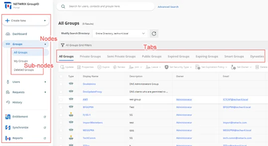
GroupID enables you to customize the nodes, sub-nodes, and their respective tabs.
What do you want to do?
At the node level:
- Add a Node (Category)
- Update the Details of a Node
- Rearrange the Nodes on the Navigation Bar
- Remove a User-defined Node
At the sub-node level:
- Add a Sub-node to a Node
- Update the Details of a Sub-node
- Rearrange the Sub-nodes for a Node
- Remove a Sub-node from a Node
At the tab level:
Add a Node (Category)
The following nodes have been defined by default on the navigation bar:
| Category (Node) | Mapped To |
|---|---|
| Create New | The Create New button on the portal’s navigation bar. It has four buttons as its sub-nodes: Group, User, Mailbox, and Contact. Sub nodes do not have tabs. |
| High Priority | The Dashboard node on the navigation bar. It has one sub-node, Dashboard, with no tab. |
| Groups | The Groups node on the navigation bar. It has four sub-nodes: All Groups, My Groups, Transfer Ownership, and Deleted Groups. All except the Transfer Ownership sub-node have tabs. |
| Users | The Users node on the navigation bar. It has two sub-nodes: My Direct Reports and Linked Accounts. Only the My Direct Reports sub-node has tabs. |
| Requests | The Requests node on the navigation bar. It has three sub-nodes: All Requests, My Requests, and Request Inbox. Sub nodes do not have tabs. |
| Others | The History node on the navigation bar. It has one sub-node, History, that has tabs. |
| External Links | The Entitlement, Synchronize, and Reports nodes on the navigation bar. It has three sub-nodes, Entitlement, Synchronize, and Reports, that can be modified to a limited extent. You cannot manage the tabs or other options displayed under these nodes in the portal. |
Note the following:
- The Create New, High Priority, Others, and External Links nodes cannot be edited or removed.
- You can add and remove sub-nodes for nodes; however, you cannot add sub-nodes for the Create New node.
- You cannot add tabs to sub-nodes; only edit and remove tabs that exist by default.
To add a node:
-
In Admin Center, select Applications in the left pane.
On the GroupID Portal tab, a portal's card displays its info. -
Click the ellipsis button for a portal and select Settings.
-
Select an identity store under Design Settings to customize the portal for it.
All identity stores linked with the portal are listed under Design Settings. You can design a different portal for each of these. -
Click Navigation Bar in the left pane.
The Navigation Bar page has two tabs: the Navigation Bar Categories tab is used to manage nodes while the Navigation Bars tab is used to manage sub-nodes and their respective tabs. -
Click Navigation Bar Categories to define a new node.
-
On the Navigation Bar Categories tab, click Add. The Add Navigation Category pane is displayed.
-
Enter a name for the node in the Title box. The node will be displayed with this name on the navigation bar.
-
In the Access Level drop-down list, select a security role. The node would be visible to users of this role and roles with a priority value higher than this role. For all other users, the node would be hidden. See Priority.
Select Never to hide the node for all users. -
In the Tooltip Text box, enter the text to appear when a user hovers the mouse over the node.
-
Use the Icon Class box to upload the image (icon) to be displayed with the node name.
-
If no image is uploaded, click Save to browse and select an image for upload.
-
If an image has been uploaded, the very image is displayed. Click the icon below the image to replace the existing image with a new one.
NOTE: Image dimensions: 30 x 30 pixels
Supported formats: .webp, .jpg, .jpe, .jpeg
-
-
Click OK.
-
Click Save on the Navigation Bar page.
Update the Details of a Node
You can update the following details for the Groups, Users, and Requests nodes on the portal’s navigation bar:
- Node name
- Access level
- Tooltip text
- Node icon
The Create New, High Priority, Others, and External Links nodes cannot be modified.
To update a node:
- In Admin Center, select Applications in the left pane.
On the GroupID Portal tab, a portal's card displays its info. - Click the ellipsis button for a portal and select Settings.
- Select an identity store under Design Settings to customize the portal for it.
All identity stores linked with the portal are listed under Design Settings. You can design a different portal for each of these. - Click Navigation Bar in the left pane. Then click the Navigation Bar Categories tab.
- On the Navigation Bar Categories tab, click Edit for a node to update it.
The Edit Navigation Category pane is displayed. Follow step 7 and onwards in the Add a Node (Category) topic to update node details.
Rearrange the Nodes on the Navigation Bar
- In Admin Center, select Applications in the left pane.
On the GroupID Portal tab, a portal's card displays its info. - Click the ellipsis button for a portal and select Settings.
- Select an identity store under Design Settings to customize the portal for it.
All identity stores linked with the portal are listed under Design Settings. You can design a different portal for each of these. - Click Navigation Bar in the left pane. Then click the Navigation Bar Categories tab. The Navigation Bar Categories tab is displayed.
- To rearrange the nodes on the navigation bar, click the equal sign for a node and drag to change
its position.
You can move all except the Create New node. - Click Save.
Remove a User-defined Node
You can delete user-defined nodes on the portal’s navigation bar. System-defined nodes cannot be deleted.
To delete a node:
- In Admin Center, select Applications in the left pane.
On the GroupID Portal tab, a portal's card displays its info. - Click the ellipsis button for a portal and select Settings.
- Select an identity store under Design Settings to customize the portal for it.
All identity stores linked with the portal are listed under Design Settings. You can design a different portal for each of these. - Click Navigation Bar in the left pane. Then click the Navigation Bar Categories tab.
- On the Navigation Bar Categories tab, click Remove for a node to delete it.
- Click Save.
Add a Sub-node to a Node
You can customize the nodes on the portal’s navigation bar by defining sub-nodes for them. Note that:
- You cannot add sub-nodes to the Create New node.
- You cannot add tabs to a sub-node.
To define a sub-node:
-
In Admin Center, select Applications in the left pane.
On the GroupID Portal tab, a portal's card displays its info. -
Click the ellipsis button for a portal and select Settings.
-
Select an identity store under Design Settings to customize the portal for it.
All identity stores linked with the portal are listed under Design Settings. You can design a different portal for each of these. -
Click Navigation Bar in the left pane. The Navigation Bar page is displayed with the Navigation Bars tab selected by default.
-
In the Select Navigation Bar Type drop-down list, select a node on the portal’s navigation bar; its sub-nodes get listed under Name.
-
To add a sub-node to the selected node, click Add .The Add Link pane is displayed.
-
In the Tab Name box, enter a name for the sub-node.
-
In the Display Text box, enter the text to display as the sub-node name on the navigation bar.
-
In the Tooltip Text box, enter the text to appear when a user hovers the mouse over the sub-node.
-
Use the Icon Class box to upload the image (icon) to be displayed with the sub-node name. See step 10 in the Add a Node (Category) topic for details.
The facility to upload an image is not available for sub-nodes under Groups. Users, Requests, and External Links. -
In the URL box, provide the URL of a webpage to link to this sub-node. The respective webpage will be displayed when users click the sub-node in the portal.
Use the following formats to specify the URL:- To link a page from within the GroupID portal template:
GroupManagement/Groups/MyGroups - To link to an external webpage:
https://www.xyz.com.
Click View in Browser to preview the webpage.
- To link a page from within the GroupID portal template:
-
Select the Open in new tab check box to open the linked page in a new tab in the browser.
If you do not select it, users will directly navigate to the linked page. They will have to use the browser’s back button to return to the previous page. -
In the Access Level drop-down list, select a security role. The sub-node would be visible for users of this role and roles with a priority value higher than this role. For all other users, the sub-node would be hidden. See Priority.
Select Never to hide the sub-node for all users. -
Click OK.
-
Click Save on the Navigation Bar page.
Update the Details of a Sub-node
You can change the following for a sub-node:
- The name of the sub-node
- The display name of the sub-node (this is the sub-node’s name on the portal’s navigation bar)
- The tooltip text for the sub-node
- The URL of the webpage that opens when a user clicks the sub-node
- Access level
To update sub-node properties:
- In Admin Center, select Applications in the left pane.
On the GroupID Portal tab, a portal's card displays its info. - Click the ellipsis button for a portal and select Settings.
- Select an identity store under Design Settings to customize the portal for it.
All identity stores linked with the portal are listed under Design Settings. You can design a different portal for each of these. - Click Navigation Bar in the left pane. The Navigation Bar page is displayed with the Navigation Bars tab selected by default.
- In the Select Navigation Bar Type drop-down list, select a node on the portal’s navigation bar; its sub-nodes get listed under Name.
- Click Edit for a sub-node to update its properties; the Edit Link pane is displayed.
- Follow steps 7-14 in the Add a Sub-node to a Node topic to update
the required information and save it.
The Links section is displayed for system-defined nodes only. Use it to manage the tabs for a sub-node.
Rearrange the Sub-nodes for a Node
- In Admin Center, select Applications in the left pane.
On the GroupID Portal tab, a portal's card displays its info. - Click the ellipsis button for a portal and select Settings.
- Select an identity store under Design Settings to customize the portal for it.
All identity stores linked with the portal are listed under Design Settings. You can design a different portal for each of these. - Click Navigation Bar in the left pane. The Navigation Bar page is displayed with the Navigation Bars tab selected by default.
- In the Select Navigation Bar Type drop-down list, select a node on the portal’s navigation bar; its sub-nodes get listed under Name.
- To rearrange the sub-nodes under the selected node, click the equal sign for a sub-node and drag to change its position.
- Click Save.
Remove a Sub-node from a Node
- In Admin Center, select Applications in the left pane.
On the GroupID Portal tab, a portal's card displays its info. - Click the ellipsis button for a portal and select Settings.
- Select an identity store under Design Settings to customize the portal for it.
All identity stores linked with the portal are listed under Design Settings. You can design a different portal for each of these. - Click Navigation Bar in the left pane. The Navigation Bar page is displayed with the Navigation Bars tab selected by default.
- In the Select Navigation Bar Type drop-down list, select a node on the portal’s navigation bar; its sub-nodes get listed under Name.
- Click Remove for a sub-node to remove it. This also removes all tabs defined for the sub-node.
- Click Save.
Update Tab Properties
You can modify the following for a tab:
- The name of the tab
- The display name of the tab (the tab is displayed in the portal with this name)
- Tooltip text
- The URL of the webpage that opens when a user clicks the tab
- Access level
To update tab properties:
-
In Admin Center, select Applications in the left pane.
On the GroupID Portal tab, a portal's card displays its info. -
Click the ellipsis button for a portal and select Settings.
-
Select an identity store under Design Settings to customize the portal for it.
All identity stores linked with the portal are listed under Design Settings. You can design a different portal for each of these. -
Click Navigation Bar in the left pane. The Navigation Bar page is displayed with the Navigation Bars tab selected by default.
-
In the Select Navigation Bar Type drop-down list, select a node on the portal’s navigation bar; its sub-nodes get listed under Name.
-
Click Edit for a system-defined sub-node. On the Edit Link pane, the Links area lists the tabs for the sub-node (in case the sub-node has tabs).
-
Click Edit for a tab to edit it.
-
On the Edit Link pane (for the tab), update the required information and click OK:
- Link Name – The name of the tab.
- Display Text – The text displayed as the tab name in the portal.
- Tooltip Text – The text that appears when a user hovers the mouse over the tab.
- URL – The address of the webpage to display when a user clicks the tab.
- Access Level – Select a security role. The tab would be visible to users of this role and
roles with a priority value higher than this role. For all other users, the tab would be
hidden. See
Priority.
Select Never to hide the tab for all users.
-
Click OK twice on the Edit Link pane.
-
Click Save on the Navigation Bar page.
Rearrange the Tabs for a Sub-node
- In Admin Center, select Applications in the left pane.
On the GroupID Portal tab, a portal's card displays its info. - Click the ellipsis button for a portal and select Settings.
- Select an identity store under Design Settings to customize the portal for it.
All identity stores linked with the portal are listed under Design Settings. You can design a different portal for each of these. - Click Navigation Bar in the left pane. The Navigation Bar page is displayed with the Navigation Bars tab selected by default.
- In the Select Navigation Bar Type drop-down list, select a node on the portal’s navigation bar; its sub-nodes get listed under Name.
- Click Edit for a system-defined sub-node. On the Edit Link pane, the Links area lists the tabs for the sub-node (in case the sub-node has tabs).
- To change the order in which tabs are displayed in the portal, click the equal sign for a tab and drag to change its position.
- Click OK.
- Click Save on the Navigation Bar page.
Remove a Tab from a Sub-node
- In GroupID Admin Center, select Applications in the left pane.
On the GroupID Portal tab, a portal's card displays its info. - Click the ellipsis button for a portal and select Settings.
- Select an identity store under Design Settings to customize the portal for it.
All identity stores linked with the portal are listed under Design Settings. You can design a different portal for each of these. - Click Navigation Bar in the left pane. The Navigation Bar page is displayed with the Navigation Bars tab selected by default.
- In the Select Navigation Bar Type drop-down list, select a node on the portal’s navigation bar; its sub-nodes get listed under Name.
- Click Edit for a system-defined sub-node. On the Edit Link pane, the Links area lists the tabs for the sub-node (in case the sub-node has tabs).
- Click Remove for a tab to remove it.
- Click OK.
- Click Save on the Navigation Bar page.
See Also
Specify Attributes for the Object Card
In the portal, the names of directory objects are displayed as links. When a user hovers the mouse over this link, a card is displayed, showcasing information about the object. For a user object, for example, the card displays the name, email address and phone number. It is as:

For each object type, you can specify a different set of attributes to display on this card. For a group, the card is as:

Notice that the card has three sections, namely:
- Header - The card template allows for four attributes to be specified for display in the header. When a specified attribute does not contain a value, NA is displayed on the card.
- Body - You can specify any number of attributes for this section. When you do not specify any attribute, this section is not displayed.
- Footer - This section has the Add To Contact and Send An Email buttons. You can choose whether you want to display these buttons on the card or not.
What do you want to do?
- Manage the Card Header
- Manage the Card Footer
- Specify an Attribute for the Card Body
- Update the Display Name for an Attribute
- Remove an Attribute
Manage the Card Header
By default, four attributes are specified for display in the card header. You can change the default attributes, but you cannot add a fifth attribute or reduce the number to three.
To modify the card header:
- In Admin Center, select Applications in the left pane.
On the GroupID Portal tab, a portal's card displays its info. - Click the ellipsis button for a portal and select Settings.
- Select an identity store under Design Settings to customize the portal for it.
All identity stores linked with the portal are listed under Design Settings. You can design a different portal for each of these. - Click Card View in the left pane. The Card View page is displayed.
- In the Select Directory Object drop-down list, select User, Contact, Group, or Mailbox to manage the card for.
- In the Name list, click Edit for Header.
The Card View Header/Footer pane displays a sample header and how the specified attributes populate it. - From the Title drop-down list, select an attribute whose value will be displayed as the title of the header. By default, the title is set to the object’s display name.
- From the Image drop-down list, select an attribute that can store images for directory objects .
- Use the Attribute 1 and Attribute 2 drop-down lists to select any other object attributes to display on the card. By default, mail and mobile are selected.
- Click OK.
- Click Save on the Card View page.
Manage the Card Footer
- In Admin Center, select Applications in the left pane.
On the GroupID Portal tab, a portal's card displays its info. - Click the ellipsis button for a portal and select Settings.
- Select an identity store under Design Settings to customize the portal for it.
All identity stores linked with the portal are listed under Design Settings. You can design a different portal for each of these. - Click Card View in the left pane.
- On the Card View page, use the Select Directory Object drop-down list to select User, Contact, Group, or Mailbox to manage the card for.
- In the Name list, click Edit for Header.
- In the Footer section of the Card View Header/Footer pane, select the Add to Contact and Send Email check boxes to display the respective buttons on the card.
- Click OK.
- Click Save on the Card View page.
Specify an Attribute for the Card Body
In addition to the card header, you can specify additional object attributes for the card. The values of these attributes would be displayed on the card body.
To add an attribute:
- In Admin Center, select Applications in the left pane.
On the GroupID Portal tab, a portal's card displays its info. - Click the ellipsis button for a portal and select Settings.
- Select an identity store under Design Settings to customize the portal for it.
All identity stores linked with the portal are listed under Design Settings. You can design a different portal for each of these. - Click Card View in the left pane.
- On the Card View page, use the Select Directory Object drop-down list to select User, Contact, Group, or Mailbox to manage the card for.
- Click Add to add an attribute to the body of the card. The Add New Card View Attribute pane is displayed.
- Use the Field Name box to select one or more schema attributes. The value of these attributes will be displayed on the object card.
- Specify a name for the attribute in the Display Name box. The attribute value would be
displayed next to this label on the card.
This box is not available when multiple attributes are selected. - Click OK.
- Click Save on the Card View page.
Update the Display Name for an Attribute
You can update the display name of an attribute on the body of an object card.
To update the display name:
- In Admin Center, select Applications in the left pane.
On the GroupID Portal tab, a portal's card displays its info. - Click the ellipsis button for a portal and select Settings.
- Select an identity store under Design Settings to customize the portal for it.
All identity stores linked with the portal are listed under Design Settings. You can design a different portal for each of these. - Click Card View in the left pane.
- On the Card View page, use the Select Directory Object drop-down list to select User, Contact, Group, or Mailbox to manage the card for.
- In the Name list, click Edit for an attribute.
- On the Edit Card View Attribute pane, the Field Name box is not editable, so you cannot change the attribute. However, you can specify a different display name for it. This display name is displayed on the card's body and the attribute’s value is shown next to it.
- Click OK.
- Click Save on the Card View page.
Remove an Attribute
You can remove an attribute from the body of an object card.
To remove an attribute:
- In Admin Center, select Applications in the left pane.
On the GroupID Portal tab, a portal's card displays its info. - Click the ellipsis button for a portal and select Settings.
- Select an identity store under Design Settings to customize the portal for it.
All identity stores linked with the portal are listed under Design Settings. You can design a different portal for each of these. - Click Card View in the left pane.
- On the Card View page, use the Select Directory Object drop-down list to select User, Contact, Group, or Mailbox to manage the card for.
- In the Name list, click Remove for an attribute to remove it.
- Click Save.
See Also
Specify Attributes for Object List View
In the portal, the object list refers to a listing of groups that are similar to another group, Group similarity is measured on the basis of group type and membership.
Let’s assume you want to view the groups that are similar to Group A. On the Similar Groups tab in Group A’s properties, six groups that bear the most similarity to Group A will be displayed, with the strongest match at the top. It is as:

For a similar group, three attributes are displayed:
- Attribute 1 - The group’s display name. This attribute cannot be changed.
- Attribute 2 - You can specify any attribute. The default attribute is mail.
- Attribute 3 - You can specify any attribute. The default attribute is expiration policy.
What do you want to do?
Change the Attributes on the Object List
- In Admin Center, select Applications in the left pane.
On the GroupID Portal tab, a portal's card displays its info. - Click the ellipsis button for a portal and select Settings.
- Select an identity store under Design Settings to customize the portal for it.
All identity stores linked with the portal are listed under Design Settings. You can design a different portal for each of these. - Click Card View in the left pane.
- On the Card View page, select Object List in the Select Directory Object drop-down
list.
The Name list shows the Header option only. - Click Edit for Header.
On the Card View Header/Footer pane, you can view the attributes currently displayed for a similar group in the portal. - The Title box displays the displayName attribute. The value of this attribute will be displayed as the name of a similar group.
- The Image box displays the thumbnailPhoto attribute, which can store images for directory objects .
- Use the Attribute 1 and Attribute 2 boxes to display any other object attributes for similar groups. By default, the mail and expiration policy attributes are selected.
- Click OK.
- Click Save on the Card View page.
See Also
Customize Properties Pages
GroupID enables you to customize the property pages displayed in the portal for these directory objects:
- User
- Group
- Smart Group
- Parent Dynasty
- Middle Dynasty
- Leaf Dynasty
- Mailbox
- Contact
- Computer (Only available for adding to group memberships in the portal. Its properties are read-only.)
NOTE: A Microsoft Entra ID identity store does not support the computer and contact object types.
In the GroupID portal, the properties page of an object has multiple tabs, where each tab groups similar attributes. These tabs are referred to as categories.
You can customize the following:
For a tab:
- Add a new tab (category) to an object’s properties page
- Update the details for a tab
- Remove a tab from an object’s properties page
For a field on a tab:
- Add a field to a tab
- Update the details for a field
- Rearrange the fields on a tab
- Remove a field from a tab
What do you want to do?
- Add a Tab (Category)
- Update Tab Details
- Remove a Tab
- Add a Field to a Tab
- Update a Field
- Rearrange the Fields on a Tab
- Remove a Field from a Tab
Add a Tab (Category)
-
In Admin Center, select Applications in the left pane.
On the GroupID Portal tab, a portal's card displays its info. -
Click the ellipsis button for a portal and select Settings.
-
Select an identity store under Design Settings to customize the portal for it.
All identity stores linked with the portal are listed under Design Settings. You can design a different portal for each of these. -
Click Properties in the left pane; the Properties page is displayed.
-
In the Select Directory Object list, select a directory object to add a tab to its properties page.
The Name list displays the tabs (categories) currently available on the object’s properties page. -
Click Add. The Add Design Category pane is displayed.
-
Enter a name for the tab in the Name box. The tab will be displayed on the object’s properties page with this name.
-
In the Visibility Level drop-down list, select a security role. The tab would be visible to users of this role and roles with a priority value higher than this role. The tab would not be visible to group owners (for their respective groups) and user managers (for their direct reports) if they fall in a lower priority role. See Priority.
-
Select Never to hide the tab from all users.
-
Select Manager and Owner to make the tab visible only to the owner (in case of a group) or manager (in case of a user or contact). It would be hidden from other users, such as group members or a user. For example:
- If Manager and Owner is selected for the Email tab in group properties, the tab would be visible to group owners for their respective groups in the portal.
- If Manager and Owner is selected for the Account tab in user properties, the tab would be visible to managers for their respective direct reports in the portal.
-
If you have selected ‘User’ or ‘Mailbox’ in the Select Directory Object drop-down list, the Self option is also available in the Visibility Level drop-down list. Select Self to make the tab visible to the respective user or mailbox. It would be hidden from other users, such as the user’s manager. For example, if the Self role is selected for the General tab in user properties, it means that:
- A user can view the General tab on his or her properties page. He or she cannot view this tab on the properties page of another user.
- A role with a higher priority value cannot see it for another user.
- User managers cannot view it for their direct reports.
- A role with the ‘Manage any profile’ permission in the identity store cannot view it for other users.
-
-
In the Access Level drop-down list, select a security role. Users of this role and roles with a priority value higher than it can add and update the values of fields on this tab. If group owners/user managers fall in a lower priority role, they cannot update the fields on the tab for their respective groups/direct reports. See Priority.
-
Select Never to make the tab and its fields read-only for all users.
-
Select Manager and Owner to enable the owner (in case of a group) or manager (in case of a user or contact) to specify or modify the value of the fields on the tab. It would be read-only for other users, such as group members or the respective user. For example, if Manager and Owner is selected for the Email tab in group properties, it means that:
- Only group owners can specify or modify the values of fields on this tab for their respective groups in the portal.
- A role with a higher priority value cannot specify or update field values.
- Group members cannot specify or update field values.
- A role with the ‘Manage any Group’ permission in the identity store cannot specify or update field values.
-
If you have selected ‘User’ or ‘Mailbox’ in the Select Directory Object list, the Self option is available in the Access Level drop-down list.
Select Self to enable the respective user or mailbox to specify or modify the value of the fields on the tab. The tab would be read-only for the user’s manager and other users. For example, if Self is selected for the General tab in user properties, it means that:- Only the user can add and update the values of fields on the General tab of his or her properties page.
- A role with a higher priority value cannot specify or update field values.
- The user’s manager cannot specify or update field values.
- A role with the ‘Manage any profile’ permission in the identity store cannot specify or update field values.
-
-
To add fields to the tab, see the Add a Field to a Tab topic.
-
Click OK.
-
Click Save on the Properties page.
Update Tab Details
You can change the following for a tab:
- Tab name
- Visibility level
- Access level
- Add and remove fields from the tab
To update a tab:
- In Admin Center, select Applications in the left pane.
On the GroupID Portal tab, a portal's card displays its info. - Click the ellipsis button for a portal and select Settings.
- Select an identity store under Design Settings to customize the portal for it.
All identity stores linked with the portal are listed under Design Settings. You can design a different portal for each of these. - Click Properties in the left pane.
- On the Properties page, select a directory object in the Select Directory Object list.
- In the Name list, click Edit for the tab you want to update.
- On the Edit Design Category pane, update the tab details. Refer to step 7 and onwards in the Add a Tab (Category) topic for details.
Remove a Tab
- In Admin Center, select Applications in the left pane.
On the GroupID Portal tab, a portal's card displays its info. - Click the ellipsis button for a portal and select Settings.
- Select an identity store under Design Settings to customize the portal for it.
All identity stores linked with the portal are listed under Design Settings. You can design a different portal for each of these. - Click Properties in the left pane.
- On the Properties page, select a directory object in the Select Directory Object list.
- In the Name list, click Remove for a tab to remove it.
- Click Save.
Add a Field to a Tab
-
In Admin Center, select Applications in the left pane.
On the GroupID Portal tab, a portal's card displays its info. -
Click the ellipsis button for a portal and select Settings.
-
Select an identity store under Design Settings to customize the portal for it.
All identity stores linked with the portal are listed under Design Settings. You can design a different portal for each of these. -
Click Properties in the left pane.
-
On the Properties page, select a directory object in the Select Directory Object list.
-
In the Name list, click Edit for the tab you want to add a field to.
-
On the Edit Design Category pane, click Add Field; the Add Field pane is displayed.
-
In the Field drop-down list, select a schema attribute to link to this field.
Updating the field in the portal is akin to updating the value of this attribute. -
In the Display Name box, enter a display name for the field. This name is the field’s label on the tab.
-
In the Display Type drop-down list, select the display type to use for rendering this field on the tab.
The list contains basic display types and custom display types defined on the Custom Display Types page. See the Display Type Categories topic. -
In the Visibility Level drop-down list, select a security role. The tab would be visible to users of this role and roles with a priority value higher than this role. It would not be visible to group owners (for their respective groups) and user managers (for their direct reports) if they fall under a lower priority role. See Priority.
-
Select Never to hide the field from all users.
-
Select Manager and Owner to make the field visible only to the owner (in case of a group) or manager (in case of a user or contact). It would be hidden from other users, such as group members or a user. For example:
- If Manager and Owner is selected for the Expiration Date field on the General tab in group properties, the field would be visible to group owners for their respective groups in the portal.
- If Manager and Owner is selected for the Manager field on the Organization tab in user properties, the field would be visible to managers for their direct reports in the portal.
-
If you have selected ‘User’ or ‘Mailbox’ in the Select Directory Object drop-down list, the Self option is also available in the Visibility Level drop-down list. Select Self to make the field visible to the respective user or mailbox. It would be hidden from other users, such as the user’s manager. For example, if Self is selected for the Notes field on the Phone/Notes tab in user properties, it means that:
- A user can view the field on his or her properties page only. He or she cannot see this field on the properties page of another user.
- A role with a higher priority value cannot view it for another user.
- User managers cannot view it for their direct reports.
- A role with the ‘Manage any profile’ permission in the identity store cannot view it for other users.
-
-
In the Access Level drop-down list, select a security role. Users of this role and roles with a priority value higher than this role can add and update the value of this field. If group owners/user managers fall in a lower priority role, they cannot able to update the value of the field for their respective groups/direct reports. See Priority.
-
Select Never to make this field read-only for all users.
-
Select Manager and Owner to enable only the owner (in case of a group) or manager (in case of a user or contact) to specify or modify the value of this field. It would be read-only for other users, such as group members or the respective user. For example, if Manager and Owner is selected for the Expiration Date field on the General tab in group properties, it means that:
- Only group owners can specify or modify the value of this field for their groups in the portal.
- A role with a higher priority value cannot specify or update the field value.
- Group members cannot specify or update the field value.
- A role with the ‘Manage any Group’ permission in the identity store cannot specify or update the field value.
-
If you have selected ‘User’ or ‘Mailbox’ in the Select Directory Object list, the Self option is available in the Access Level drop-down list. Select Self to enable the respective user or mailbox to specify or modify the value of the field. The field would be read-only for other users, such as the user’s manager or a role with a higher priority value. For example, if Self is selected for the Notes field on the Phone / Notes tab in user properties, it means that:
- Only the respective user can add and update the value of this field on the Phone / Notes tab in his or her properties page.
- A role with a higher priority value cannot specify or update the field value.
- The user’s manager cannot specify or update the field value.
- A role with the ‘Manage any profile’ permission in the identity store cannot specify or update the field values.
-
-
Click Advanced Options to display additional fields.
-
As mentioned for visibility level and access level, the field is visible and editable for members of the selected role and roles with a priority value higher than it.
In the Exclude Roles area, select the check boxes for the higher priority role(s) to deny them access and visibility on the field. -
In the Tooltip Text box, enter the text to display when a user hovers the mouse over the field.
-
In the Max Length box, enter a number that represents the maximum number of characters that users can enter as value for this field.
Entering 0 indicates that users can enter an unlimited number of characters as value. -
Use the Search Object Types area to specify the object types (User, Contact, and/or Group) that can be searched on the portal’s Find dialog box, to set as value for the field.
The following display types support the Find dialog box:- DN
- DNs
- Custom display types created with the Grid type
When you select any of these display types, GroupID identifies that the value for the field has to be searched and selected using the Find dialog box. The Search Object Types area is displayed, where you can select the required object type(s). For example, if you select Group, only groups can be searched and selected as value for the field.
You can launch the Find dialog box from multiple portal pages to search for objects to designate as owners, managers, additional owners, members, and more. While specifying the searchable object type(s), you must be aware of the kind of value the field requires. -
Select the Is Required check box to make it mandatory for users to provide a value for the field.
-
Select the Is Read Only check box to make the field read-only.
-
Select the Filter Bad Words check box to ensure that users do not enter any bad word in this field.
A value entered for the field is checked against the words listed on the Bad Words List page. Matched values cannot be saved. See the Manage the Bad Words List topic. -
The Image Attribute list is available when ‘DN’ is selected as the display type. This list supports ‘thumbnailPhoto’ as its value.
- Select the ‘thumbnailPhoto’ attribute in the Image Attribute drop-down list when you want
to auto upload an image for the field. Let’s assume you apply this setting for the Primary
Manager field in group properties. In the portal, the primary manager's image will be
displayed alongside his or her name on the group properties page.
Note that for the image to display, the ‘thumbnailPhoto’ attribute must have a value stored; in case of no value, an image placeholder is displayed. - If you do not want to auto upload an image for the field, clear the value in the Image Attribute box.
- Select the ‘thumbnailPhoto’ attribute in the Image Attribute drop-down list when you want
to auto upload an image for the field. Let’s assume you apply this setting for the Primary
Manager field in group properties. In the portal, the primary manager's image will be
displayed alongside his or her name on the group properties page.
-
Click OK.
The field is displayed in the Fields area on the Edit Design Category pane. You can rearrange the fields, update field details, and even remove a field from the tab. -
Click OK.
-
Click Save on the Properties page.
Update a Field
You can change the following for a field:
- The name of the field (used as the field’s label in the portal)
- The schema attribute linked with the field
- The display type used to render the field in the portal
- Visibility level
- Access level
- Tooltip
The following field properties vary from field to field. You can:
- Specify the maximum characters that a user can enter as value for the field
- Make the field editable or read–only
- Place a check that prevents users from using certain words as value for the field
- Make it optional or mandatory for users to provide a value for the field
- For search fields, you can specify the object types (groups, users, contacts) that can be searched and set as field value
- Specify whether to auto upload user photos with fields that require user names as value
To update a field:
- In Admin Center, select Applications in the left pane.
On the GroupID Portal tab, a portal's card displays its info. - Click the ellipsis button for a portal and select Settings.
- Select an identity store under Design Settings to customize the portal for it.
All identity stores linked with the portal are listed under Design Settings. You can design a different portal for each of these. - Click Properties in the left pane.
- On the Properties page, select a directory object in the Select Directory Object list.
- In the Name list, click Edit for the tab you want to update a field for.
- On the Edit Design Category pane, click Edit for a field.
- On the Edit Field pane, update the field details. Refer to step 8 and onwards in the Add a Field to a Tab topic to update the required details and save the changes.
Rearrange the Fields on a Tab
- In Admin Center, select Applications in the left pane.
On the GroupID Portal tab, a portal's card displays its info. - Click the ellipsis button for a portal and select Settings.
- Select an identity store under Design Settings to customize the portal for it.
All identity stores linked with the portal are listed under Design Settings. You can design a different portal for each of these. - Click Properties in the left pane.
- On the Properties page, select a directory object in the Select Directory Object list.
- In the Name list, click Edit for the tab you want to rearrange the fields for.
- On the Edit Design Category pane, the Fields area displays the fields on the tab.
To rearrange the fields, click the equal sign for a field and drag to change its position. - Click OK.
- Click Save on the Properties page.
Remove a Field from a Tab
- In Admin Center, select Applications in the left pane.
On the GroupID Portal tab, a portal's card displays its info. - Click the ellipsis button for a portal and select Settings.
- Select an identity store under Design Settings to customize the portal for it.
All identity stores linked with the portal are listed under Design Settings. You can design a different portal for each of these. - Click Properties in the left pane.
- On the Properties page, select a directory object in the Select Directory Object list.
- In the Name list, click Edit for the tab you want to remove a field from.
- On the Edit Design Category pane, the Fields area displays the fields on the tab.
Click Remove for a field to remove it. - Click OK.
- Click Save on the Properties page.
See Also
Specify Attributes for Organizational Hierarchy
Using the portal, you can view the organizational hierarchy for a user in the organization. This hierarchy is displayed in graphical form, creating a kind of an organogram. It presents a 360° view of the organization with the specified user as the focal point.
By default, the organizational hierarchy chart displays four attributes of a user: title, display name, email, and picture. You can replace an attribute with another one but you cannot add or remove attributes. Hence the attribute count remains ‘four’.
What do you want to do?
Replace an Attribute on the Organizational Hierarchy Tree
- In Admin Center, select Applications in the left pane.
On the GroupID Portal tab, a portal's card displays its info. - Click the ellipsis button for a portal and select Settings.
- Select an identity store under Design Settings to customize the portal for it.
All identity stores linked with the portal are listed under Design Settings. You can design a different portal for each of these. - Click Organizational Hierarchy in the left pane. The Organizational Hierarchy page is
displayed.
By default, the Display Name area displays four attributes. The values of these attributes are displayed for users on the organizational hierarchy chart in the portal. You can only replace an attribute with another attribute; you cannot add a fifth attribute or reduce the list to three. - Click Edit for an attribute to replace it. The Edit Field pane is displayed.
- In the Field drop-down list, select a schema attribute to display on the organizational hierarchy chart.
- In the Display Name box, enter a user-friendly name for the attribute, that would serve as the attribute name on the chart. The attribute’s value will be displayed next to this name.
- In the Display Type drop-down list, select the display type to use for rendering the
attribute on the organizational hierarchy chart. The display type must match the attribute. For
example, the ‘TreePicture’ display type matches the ‘thumbnailPhoto’ attribute.
This list contains basic display types and custom display types defined on the Custom Display Types page. See the Display Type Categories topic. - Click OK.
- Click Save on the Organizational Hierarchy page.
See Also
Manage Property Validation Attributes
In GroupID, property validation applies to:
- Users
- Groups
Profile Validation for Users
Profile validation is designed to ensure the accuracy of users’ information in the directory. It applies to users who are members of the group specified for profile validation in an identity store. These users must verify and update their directory profile information at a set frequency using the portal.
While validating his or her profile, a user can:
- Update his or her directory profile information
- Change his or her primary manager
- Transfer his or her direct reports to another manager
- Terminate his or her direct reports
You can specify the schema attributes (fields) for user profile validation. These attributes (fields) are displayed on the Validate Profile Properties window of the portal, where users can validate and update the values for these attributes.
NOTE: A few fields for profile validation are specified in the default portal template. You can add more fields, edit the existing fields, or remove them. However, the My Direct Reports field can neither be edited nor removed.
Property Validation for Groups
The GroupID administrator can enforce group owners to review and validate the attributes and membership of an expiring group before renewing it. See the Enable Group Attestation topic.
While attesting a group in the portal, the owner can:
- Update a few attributes, such as the group’s display name, expiration policy, security type, etc.
- Verify the group’s membership and inactivate undesired members. Inactive members are removed from group membership instantly or after x number of days, depending on the configurations made by the administrator.
Group attestation applies to expiring groups with an expiry policy other than ‘never expire’.
You can specify the schema attributes (fields) for group attestation. These attributes (fields) are displayed on the Attest & Renew Group wizard in the portal, where group owners can validate and update the values for these attributes.
NOTE: A few fields for group attestation are specified in the default portal template. You can add more fields, edit the existing fields, or remove them. However, the Members grid can neither be edited nor removed.
What do you want to do?
Add a Property Validation Field
-
In Admin Center, select Applications in the left pane.
On the GroupID Portal tab, a portal's card displays its info. -
Click the ellipsis button for a portal and select Settings.
-
Select an identity store under Design Settings to customize the portal for it.
All identity stores linked with the portal are listed under Design Settings. You can design a different portal for each of these. -
Click Property Validation in the left pane. The Property Validation page is displayed.
-
In the Select Directory Object drop-down list, select:
- Group: to add, edit, or remove attributes for group attestation.
- User: to add, edit, or remove attributes for user profile validation.
On selecting an option, the fields available for group attestation/profile validation in the portal are listed under Name.
-
Click Add to specify a new attribute (field) for group attestation/profile validation.
The Add Profile Validation Attribute pane is displayed. -
Select an attribute from the Field drop-down list.
-
In the Display Name box, specify a name to use as the field’s label on the Attest & Renew Group wizard/Validate Profile Properties window of the portal.
-
Use the Display Type drop-down list to specify the display type to use for rendering the attribute in the portal. The list contains basic display types and custom display types defined on the Custom Display Types page. See the Display Type Categories topic.
-
In the Visibility Level drop-down list, select a security role. The field would be visible to users of this role and roles with a priority value higher than this role. See Priority.
Select Never to hide the field from all users. -
As mentioned for visibility level, the field is visible to members of the selected role and roles with a priority value higher than the selected role.
In the Exclude Roles area, select the check boxes for the higher priority role(s) you want to hide the field from. -
In the ToolTip Text box, enter the text to display when a user hovers the mouse over the field.
-
In the Max Length box, enter a number that represents the maximum number of characters that users can enter as value for the field. Entering 0 indicates that the field can accept an unlimited number of characters for its value.
-
Select the Is Required check box to make it mandatory for users to provide a value for the field.
-
Select the Is Read Only check box to make the field read-only.
-
Select the Filter Bad Words check box to ensure that users do not enter any bad word in this field.
A value entered for the field is checked against the words listed on the Bad Words List page. Matched values cannot be saved. See the Manage the Bad Words List topic. -
The Image Attribute list is available when ‘DN’ is selected as the display type. This list supports ‘thumbnailPhoto’ as its value.
- Select the ‘thumbnailPhoto’ attribute in the Image Attribute drop-down list when you want
to auto upload an image for the field. Let’s assume you apply this setting while defining the
Primary Manager field on the Validate Profile Properties window. In the portal, the
primary manager's image will be displayed alongside his or her name on the Validate Profile
Properties window.
Note that for the image to display, the ‘thumbnailPhoto’ attribute must have a value stored; in case of no value, an image placeholder is displayed. - If you do not want to auto upload an image for the field, clear the value in the Image Attribute box.
- Select the ‘thumbnailPhoto’ attribute in the Image Attribute drop-down list when you want
to auto upload an image for the field. Let’s assume you apply this setting while defining the
Primary Manager field on the Validate Profile Properties window. In the portal, the
primary manager's image will be displayed alongside his or her name on the Validate Profile
Properties window.
-
Click OK.
-
Click Save on the Property Validation page.
Update a Field
You can change the following for a field available in the portal for group attestation or user profile validation:
- The attribute mapped to the field
- The display name (the field is displayed with this label in the portal)
- The display type used to render the field in the portal
- Visibility level
- Tooltip
The following field properties vary from field to field. You can:
- Specify the maximum characters that a user can enter as value for the field
- Whether to auto upload an image with the field
- Make the field editable or read–only
- Make it optional or mandatory for users to provide a value for the field
- Prevent users from using certain words as value for the field
To update field properties:
-
In Admin Center, select Applications in the left pane.
On the GroupID Portal tab, a portal's card displays its info. -
Click the ellipsis button for a portal and select Settings.
-
Select an identity store under Design Settings to customize the portal for it.
All identity stores linked with the portal are listed under Design Settings. You can design a different portal for each of these. -
Click Property Validation in the left pane.
-
On the Property Validation page, select Group or User in the Select Directory Object drop-down list.
- Group: to update a field for group attestation
- User: to update a field for user profile validation
-
In the Name area, click Edit for a field.
-
On the Edit Profile Validation Attribute pane, update the required information. Follow steps 7-19 in the Add a Property Validation Field topic for help.
Remove a Field
-
In Admin Center, select Applications in the left pane.
On the GroupID Portal tab, a portal's card displays its info. -
Click the ellipsis button for a portal and select Settings.
-
Select an identity store under Design Settings to customize the portal for it.
All identity stores linked with the portal are listed under Design Settings. You can design a different portal for each of these. -
Click Property Validation in the left pane.
-
On the Property Validation page, select Group or User in the Select Directory Object drop-down list.
- Group: to remove a field from the Attest & Renew Group wizard in the portal.
- User: to remove a field from the Validate Profile Properties window in the portal.
-
In the Name area, click Remove for a field to remove it.
-
Click Save.
See Also
Specify Smart Group Query Attributes
For an identity store, you can choose whether all or specific schema attributes should be available on the following pages in the portal:
-
The Query Designer, where you can specify queries for Smart Groups and Dynasties for membership update. The Query Designer can be launched from:
- The Create Object wizard for Smart Groups and Dynasties
- The properties page for Smart Groups and Dynasties
- When you upgrade a static group to a Smart Group or Dynasty
The schema attributes you specify would be available to portal users on the Filter Criteria tab of the Query Designer for building Smart Group/Dynasty queries.
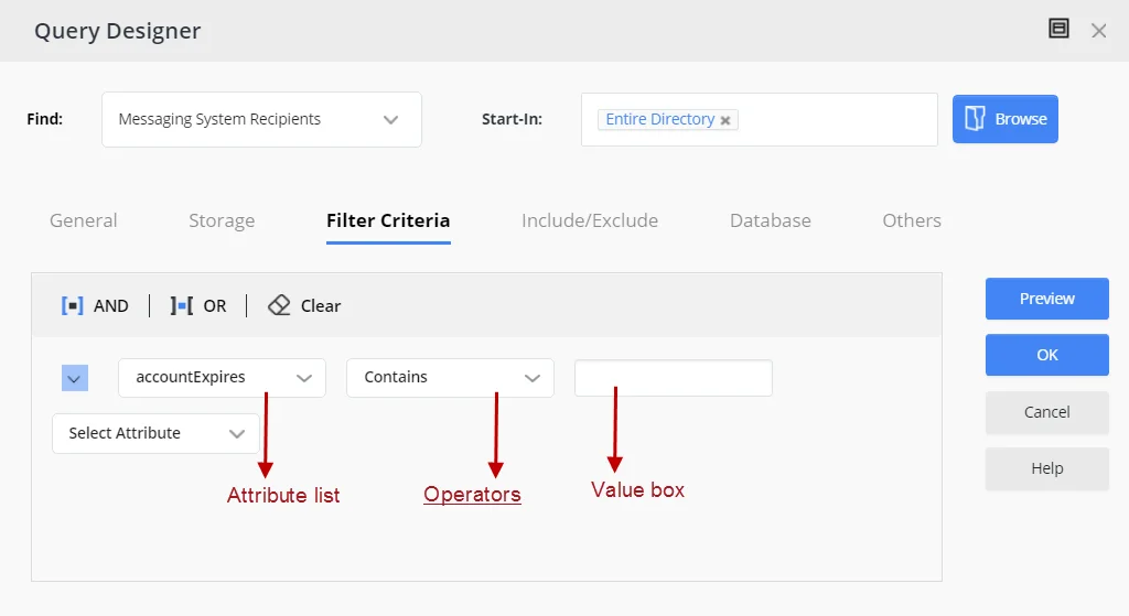
-
The Sub-Manager Query Designer for a Recursive Managerial Dynasty, where you can specify a query for sub-manager selection.
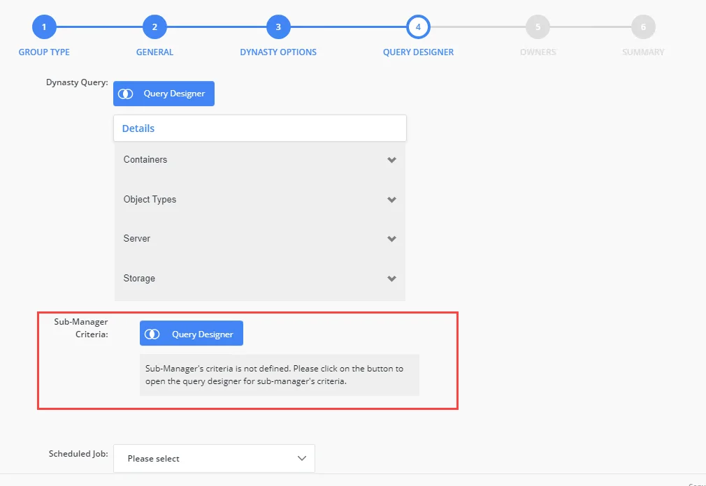
-
The Add Attributes dialog box for Dynasties. The schema attributes you specify would be available in the Group Items By field, which is used to divide the query results into groups. GroupID creates a new child group for each unique value of the attribute that users select in the Group Items By field.

-
The Query Designer for importing members to a group using an external data source. The specified schema attributes would be available on the Filter Criteria tab of the Query Designer for building membership import queries.
You can launch this Query Designer using the Import button on the Members tab in group properties (for static groups, Smart Groups and Dynasties).
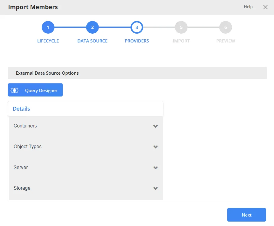
-
The Query Designer for query-based search, where users can define a query to search the directory.
The schema attributes you specify would be available to portal users on the Filter Criteria tab of the Query Designer for building search queries.
Users can launch the Query Designer for searches from the portal’s Advanced Search page.
You can also specify the following for an attribute:
- The operator(s) that can be applied to the attribute on the Query Designer dialog boxes. For example, if you allow the ‘Contains’ and ‘Equals’ operators for the ‘cn’ attribute, then only these operators will be displayed when users select the ‘cn’ attribute on any of the Query Designers.
- The display type to use for specifying the value of the attribute. For example, it can be a simple text box, a drop-down list, or a button that launches the Find dialog box for searching and selecting an object.
- The maximum number of characters that users can enter as value for an attribute.
What do you want to do?
- Allow All Schema Attributes
- Allow Specific Attributes
- Update the Properties of a Query Attribute
- Remove a Query Attribute
Allow All Schema Attributes
- In Admin Center, select Applications in the left pane.
On the GroupID Portal tab, a portal's card displays its info. - Click the ellipsis button for a portal and select Settings.
- Select an identity store under Design Settings to customize the portal for it.
All identity stores linked with the portal are listed under Design Settings. You can design a different portal for each of these. - Click Smart Group Attributes in the left pane.
- On the Smart Group Attributes page, click the All Attributes tile under Select Smart
Group Attributes.
All schema attributes in the identity store (directory) would be available to portal users on the different Query Designers and the Add Attributes dialog box. - Click Save.
Allow Specific Attributes
-
In Admin Center, select Applications in the left pane.
On the GroupID Portal tab, a portal's card displays its info. -
Click the ellipsis button for a portal and select Settings.
-
Select an identity store under Design Settings to customize the portal for it.
All identity stores linked with the portal are listed under Design Settings. You can design a different portal for each of these. -
Click Smart Group Attributes in the left pane.
-
On the Smart Group Attributes page, click the Selected Attributes tile under Select Smart Group Attributes. The Name column lists any attributes that you have already specified.
-
To add an attribute, click Add. The Add Smart Group Attribute pane is displayed.
-
Use the Fields box to select one or more schema attributes. These attributes would be available in the portal, where users can use them for building Smart Group queries and other purposes.
-
Use the Display Name box to specify a user-friendly name for the attribute. The attribute would be displayed in the portal with this name.
This box is not available when multiple attributes have been selected. -
Select a security role in the Visibility Level drop-down list. The attribute(s) would be visible to users of the selected role and roles with a priority value higher than the selected role. See Priority.
Select Never to hide the attribute(s) from all users. -
Use the Display Type drop-down list to specify the display type to use for enabling users to provide a value for the attribute(s) in the portal. For example, you can select a text box, drop-down list, or DN as display type. In case of DN, users can search and select a directory object as value for the attribute.
The list contains basic display types and custom display types defined on the Custom Display Types page. See the Display Type Categories topic.
When multiple attributes are selected in the Fields box, this display type applies to each of them. You can edit an attribute later to apply a different display type. -
In the ToolTip Text box, enter the text to display when a user hovers the mouse over the attribute .
This box is not available when multiple attributes have been selected.
-
In the Max Length box, enter a number that represents the maximum number of characters that users can enter as value for an attribute.
Entering 0 indicates that the attribute(s) can accept an unlimited number of characters as value. -
The Selected Operators area lists the operators that can be applied to attributes in the Query Designers.
Select the check box for the operator(s) you want to provide for the selected attribute(s). -
Click OK.
-
Click Save on the Smart Group Attributes page.
Update the Properties of a Query Attribute
You can change the following for an attribute:
- The display name of the attribute (the attribute is displayed with this name in the Query Designers and the Add Attribute dialog box)
- The operators that users can apply to the attribute in the Query Designers
- The display type used to provide a value for the attribute in the Query Designers
- The maximum characters that users can enter as value for the attribute in the Query Designers
- Visibility level
- Tooltip
To update attribute properties:
- In Admin Center, select Applications in the left pane.
On the GroupID Portal tab, a portal's card displays its info. - Click the ellipsis button for a portal and select Settings.
- Select an identity store under Design Settings to customize the portal for it.
All identity stores linked with the portal are listed under Design Settings. You can design a different portal for each of these. - Click Smart Group Attributes in the left pane.
- On the Smart Group Attributes page, click the Selected Attributes tile under Select Smart Group Attributes. The Name column lists any attributes that you have already specified.
- Click Edit for an attribute to update its properties.
- On the Edit Smart Group Attribute pane, the attribute name is read-only. To update all other details, follow steps 8 - 15 in the Allow Specific Attributes topic.
Remove a Query Attribute
- In Admin Center, select Applications in the left pane.
On the GroupID Portal tab, a portal's card displays its info. - Click the ellipsis button for a portal and select Settings.
- Select an identity store under Design Settings to customize the portal for it.
All identity stores linked with the portal are listed under Design Settings. You can design a different portal for each of these. - Click Smart Group Attributes in the left pane.
- On the Smart Group Attributes page, click the Selected Attributes tile under Select Smart Group Attributes. The Name column lists any attributes that you have already specified.
- Click Remove for an attribute to remove it. Removed attributes would not be available in the portal for building Smart Group queries and other purposes. However, Smart Groups and Dynasti created using those attributes will be unaffected.
- Click Save.
See Also
The ‘Send on Behalf’ and ‘Send As’ Permissions
Using the portal, a user can delegate the Send on Behalf and Send As permissions to other objects.
The Send on Behalf Permission
The Send on Behalf permission in Microsoft Exchange and Office 365 allows a user to send an email as another user, while showing the recipient that it was sent from a user on behalf of another user.
For example, when User A grants Send on Behalf permissions to User B, then User B can send email on behalf of User A. User B will be able to choose User A’s email address in the ‘From’ field when composing a message in Outlook. Message recipients will see both User A’s address and User B’s address, as the ‘From’ address will read as:
From: Mailbox <User B's address> on behalf of Mailbox <User A’s address>.
The Send As Permission
The Send As permission in Microsoft Exchange and Office 365 enables a user to send a message as another user. For example, when User A grants Send As permissions to User B, User B will be able to choose User A’s email address in the ‘From’ field when composing a message in Outlook. This message, while sent by User B, will appear as sent by User A.
Prerequisites for the Send As and Send on Behalf Permissions
In the following content, a ‘target object’ refers to the object that can add other objects to its Send As and Send on Behalf lists using the portal.
- The target object can be a mailbox or a mail-enabled group.
- Microsoft Exchange or Office 365 must be configured as the messaging provider for the identity store.
- An SMTP server must be configured for the identity store.
- The user logged in the portal must have the “Manage any Profile” permission for its respective role in the identity store.
- The XAdPermissionExtendedRights attribute should be available for Send As and the publicDelegates attribute should be available for Send on Behalf.
- The ExchangeTrustedsubsystem object should have modify permissions on the target objects in Active Directory for the Send As permission to be set using the portal. For more information, see Access denied when you try to give user "send-as" or "receive as" permission for a Distribution Group in Exchange Server.
What do you want to do?
Set up the Send As Feature
You can provide the Send As setting on any tab of an object’s properties page in the portal. This would enable the object to delegate the Send As permission to users.
-
In Admin Center, select Applications in the left pane.
On the GroupID Portal tab, a portal's card displays its info. -
Click the ellipsis button for a portal and select Settings.
-
Select an identity store under Design Settings to customize the portal for it.
All identity stores linked with the portal are listed under Design Settings. You can design a different portal for each of these. -
Click Properties in the left pane. The Properties page is displayed.
-
In the Select Directory Object drop-down list, select a Mailbox or Group object to add the Send As setting to its properties page. The Name list displays the tabs on the object’s properties page.
-
Click Edit for a tab (for example, the Email tab).
The Edit Design Category pane is displayed, with the Fields area displaying the fields on the tab. -
Click Add Field to add the Send As field. The Add Field pane is displayed.
-
In the Field drop-down list, select the XAdPermissionExtendedRights attribute.
-
In the Display Name box, provide a label for the field, such as ‘Send As Permissions’. The Send As field will be displayed with this name in the portal.
-
In the Display Type drop-down list, select ‘DNs’.
-
In the Visibility Level drop-down list, select a security role. The Send As field would be visible to users of this role and roles with a priority value higher than this role. It would not even be visible to group owners (for their respective groups) and user managers (for their direct reports) if they fall in a lower priority role. See Priority.
- Select Never to hide the field from all users.
- Select Manager and Owner to make the field visible only to the owner (in case of a group) or manager (in case of a mailbox). It would be hidden from other users, such as group members or the mailbox itself. In other words, the field would be visible to group owners for their respective groups and to managers for their respective direct reports in the portal.
- If you have selected ‘Mailbox’ in the Select Directory Object list, the Self option is also available in the Visibility Level drop-down list. Select Self to make the field visible only to the mailbox on his or her properties page. It would not be visible to any other user, such as a role with a higher priority value or a role with the ‘Manage any profile’ permission in the identity store.
-
In the Access Level drop-down list, select a security role. Users of this role and roles with a priority value higher than this role can add and update the value of the Send As field, i.e., add and remove objects in the Send As list. If group owners/user managers fall in a lower priority role, they would not be able to update the value of the field for their respective groups/direct reports.
- Select Never to make the field read-only for all users.
- Select Manager and Owner to enable only the owner (in case of a group) or manager (in case
of a mailbox) to specify or modify the value of this field. It would be read-only for other
users, such as group members or the mailbox itself.
In other words, only group owners can specify or modify the value of this field for their respective groups in the portal. A role with a higher priority value cannot change the value; group members cannot change the value; and even a role with the ‘Manage any Group’ permission in the identity store cannot change the value.
Similarly, only mailbox managers can specify or modify the value of this field for their respective direct reports in the portal. A role with a higher priority value cannot change the value; and even a role with the ‘Manage any profile’ permission in the identity store cannot change the value. - If you have selected ‘Mailbox’ in the Select Directory Object drop-down list, the Self option is available in the Access Level drop-down list. Select Self to enable the mailbox to specify or modify the value of the field. It would be read-only for other users, such as the mailbox’s manager or a role with a higher priority value or even a role with the ‘Manage any profile’ permission in the identity store.
-
As mentioned for access level and visibility level, the field is editable and visible to members of the selected role and roles with a priority value higher than the selected role.
In the Exclude Roles area, select the check boxes for the higher priority role(s) to deny them access and visibility on the field. -
Use the Search Object Types area to specify the object types that can be searched on the portal’s Find dialog box, to set as value for the Send As field.
The following display types support the Find dialog box:- DN
- DNs
- Custom display types created with the Grid type
When you select any of these display types, GroupID identifies that the value for the Send As field has to be searched using the Find dialog box. The Search Object Types area is displayed, where you can select the required object type(s). For example, if you select User, only user objects can be searched and selected as value for the field.
-
Select the Is Required check box to make it mandatory for users to add at least one object to the Send As list.
-
Select the Is Read Only check box to make the Send As field read-only.
-
Click OK on the Add Field pane and the Edit Design Category pane.
-
Click Save on the Properties page.
The Send As Field in the Portal
Launch the portal and go to the properties of the target object (group or mailbox) you defined the Send As field for, then click the respective tab. The Send As field is displayed as follows:
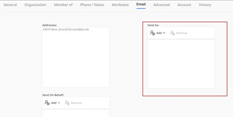
Use the Add and Remove buttons to add and remove objects in the Send As list. The added objects can send email for the target object in accordance with the Send As functionality.
Set up the Send on Behalf Feature
You can provide the Send on Behalf setting on any tab of an object’s properties page in the portal. This would enable the object to delegate the Send on Behalf permission to users.
-
In Admin Center, select Applications in the left pane.
On the GroupID Portal tab, a portal's card displays its info. -
Click the ellipsis button for a portal and select Settings.
-
Select an identity store under Design Settings to customize the portal for it.
All identity stores linked with the portal are listed under Design Settings. You can design a different portal for each of these. -
Click Properties in the left pane. The Properties page is displayed.
-
In the Select Directory Object list, select a Mailbox or Group object to add the Send on Behalf setting to its properties page. The Name list displays the tabs on the object’s properties page.
-
Click Edit for a tab (for example, the Email tab).
The Edit Design Category pane is displayed, with the Fields area displaying the fields on the tab. -
Click Add Field to add the Send on Behalf field. The Add Field pane is displayed.
-
In the Field drop-down list, select the publicDelegates attribute.
-
In the Display Name provide a label for the field, such as ‘Send on Behalf Permissions’. The Send on Behalf field will be displayed with this name on the portal.
-
In the Display Type drop-down list, select ‘DNs’.
-
In the Visibility Level drop-down list, select a security role. The Send on Behalf field would be visible to users of this role and roles with a priority value higher than this role. It would not be visible to group owners (for their groups) and user managers (for their direct reports) if they fall in a lower priority role. See Priority.
- Select Never to hide the field from all users.
- Select Manager and Owner to make the field visible only to the owner (in case of a group) or manager (in case of a mailbox). It would be hidden from other users, such as group members or the mailbox itself. In other words, the field would be visible to group owners for their respective groups and to managers for their respective direct reports in the portal.
- If you have selected ‘Mailbox’ in the Select Directory Object list, the Self option is also available in the Visibility Level drop-down list. Select Self to make the field visible only to the mailbox on his or her properties page. It would not be visible to any other user, such as a role with a higher priority value or a role with the ‘Manage any profile’ permission in the identity store.
-
In the Access Level drop-down list, select a security role. Users of this role and roles with a priority value higher than this role can add and update the value of the Send on Behalf field, i.e., add and remove objects in the Send on Behalf list. If group owners/user managers fall in a lower priority role, they would not be able to update the value of the field for their respective groups/direct reports.
- Select Never to make the field read-only for all users.
- Select Manager and Owner to enable only the owner (in case of a group) or manager (in case
of a mailbox) to specify or modify the value of this field. It would be read-only for other
users, such as group members or the mailbox itself.
In other words, only group owners can specify or modify the value of this field for their respective groups in the portal. A role with a higher priority value, group members, or a role with the ‘Manage any Group’ permission in the identity store cannot change the value.
Similarly, only mailbox managers can specify or modify the value of this field for their respective direct reports in the portal. A role with a higher priority value or a role with the ‘Manage any profile’ permission in the identity store cannot change the value. - If you have selected ‘Mailbox’ in the Select Directory Object drop-down list, the Self option is available in the Access Level drop-down list. Select Self to enable the mailbox to specify or modify the value of the field. It would be read-only for other users, such as the mailbox’s manager or a role with a higher priority value or even a role with the ‘Manage any profile’ permission in the identity store.
-
As mentioned for access level and visibility level, the field is editable and visible to members of the selected role and roles with a priority value higher than the selected role.
In the Exclude Roles area, select the check boxes for the higher priority role(s) to deny them access and visibility on the field. -
Use the Search Object Types area to specify the object types that can be searched on the portal’s Find dialog box, to set as value for the Send on Behalf field.
The following display types support the Find dialog box:- DN
- DNs
- Custom display types created with the Grid type
When you select any of these display types, GroupID identifies that the value for the Send on Behalf field has to be searched using the Find dialog box. The Search Object Types area is displayed, where you can select the required object type(s). For example, if you select User, only user objects can be searched and selected as value for the field.
-
Select the Is Required check box to make it mandatory for users to add at least one object to the Send on Behalf list.
-
Select the Is Read Only check box to make the Send on Behalf field read-only.
-
Click OK on the Add Field pane and the Edit Design Category pane.
-
Click Save on the Properties page.
The Send on Behalf Field in the Portal
Launch the portal and go to the properties of the target object (group or mailbox) you defined the Send on Behalf field for, then click the respective tab. The Send on Behalf field is displayed as follows:

Use the Add and Remove buttons to add and remove objects in the Send on Behalf list. The added objects can send email on behalf of the target object in accordance with the Send on Behalf functionality.
See Also
Customize the Toolbars
Toolbars are available on different pages of the GroupID portal; however, not all of these are customizable.
You can customize the following toolbars:
| Toolbar | Availability in the portal |
|---|---|
| User | The My Profile and user properties pages NOTE: The Validate your profile, Extend, and Reinstate buttons on this toolbar are displayed in the portal when user profile validation is enabled: |
| Group | The group properties page NOTE: (1) The Update button is not displayed for static groups. (2) The Expire button is not displayed for groups with an expiation policy set to Never Expire. (3) The Attest Group and Renew buttons are displayed when group attestation is enabled. (4) The Upgrade To button is displayed for static groups only. |
| Default Search | The All tab on the Search Results page for Quick Search and Advanced Search |
| Users Search | The Users and Contacts tabs on the Search Results page for Quick Search and Advanced Search |
| Groups Search | The Groups tab on the Search Results page for Quick Search and Advanced Search |
| My Membership Groups | The My Memberships tab of the My Groups page |
| My Expiring Groups | The My Expiring Groups tab of the My Groups page |
| My Expired Groups | The My Expired Groups tab of the My Groups page |
| My Deleted Groups | The My Deleted Groups tab of the My Groups page |
| My Dynasties | The My Dynasties tab of the My Groups page |
| My Smart Groups | The My Smart Groups tab of the My Groups page |
| All Groups | The All Groups tab of the All Groups page |
| My Groups | The My Groups tab of the My Groups page |
| Expired Groups | The Expired Groups tab of the All Groups page |
| Expiring Groups | The Expiring Groups tab of the All Groups page |
| Private Groups | The Private Groups tab of the All Groups page |
| Semi-Private Groups | The Semi-Private Groups tab of the All Groups page |
| Public Groups | The Public Groups tab of the All Groups page |
| Smart Groups | The Smart Groups tab of the All Groups page |
| Dynasties | The Dynasties tab of the All Groups page |
| My Direct Reports | The My Direct Reports tab of the Users page |
| Disabled Users | The Disabled Users tab of the Users page |
| Members Grid | The Members tab in static group properties |
| Smart Members Grid | The Members tab in Smart Group and Dynasty properties |
| User Members Of Grid | The Member Of tab in user properties |
| Computer Members Of Grid | The Member Of tab in computer properties |
| Additional Owner | The Owner tab in group properties |
| Additional Manager | The Organization tab in user properties |
| Create Group Wizard – Members | The Members page of the Create New Group wizard (for static group only) |
| Create Group Wizard - Additional Owner | The Owners page of the Create New Group wizard (for all group types) |
| Contact Member Of Grid | The Member Of tab in contact properties |
| Group Member Of Grid | The Member Of tab in group properties |
| Direct Reports Grid | The Organization tab in user properties |
NOTE: The Computer Members of Grid and Contact Member of Grid toolbars are not available for a Microsoft Entra ID identity store.
The buttons available on these toolbars are predefined. You cannot add or remove a button, but you can update a few details for a button, such as its name and image.
What do you want to do?
Update the Properties of a Toolbar Button
-
In Admin Center, select Applications in the left pane.
On the GroupID Portal tab, a portal's card displays its info. -
Click the ellipsis button for a portal and select Settings.
-
Select an identity store under Design Settings to customize the portal for it.
All identity stores linked with the portal are listed under Design Settings. You can design a different portal for each of these. -
Click Toolbars in the left pane; the Toolbars page is displayed.
-
In the Select Toolbar Type drop-down list, select the toolbar you want to update.
The Name area lists all buttons on this toolbar. -
Click Edit for a toolbar button to update its properties.
-
On the Toolbar Button Properties pane, update the following information as required:
-
Name – The name of the toolbar button. It is read-only.
-
Text – The text displayed on the button as its name.
-
Show Text – Select this check box to display the text on the button; else the button would be displayed without the text.
-
Tooltip Text - The text to appear when a user hovers the mouse over the button.
-
Icon Class – The image (icon) to be displayed for the button on the toolbar.
-
Active Icon Class – The image (icon) to be displayed when a user hovers the mouse over this button.
-
To manage images for Icon Class and Active Icon Class:
-
If no image has been uploaded, click Upload to browse and select an image to upload.
-
If an image has been uploaded, the very image is displayed. Click Upload to replace the existing image with a new one.
NOTE: Image dimensions: 30 x 30 pixels
Supported formats: .webp, .jpg, .jpe, .jpeg
-
-
Visibility Level – Select a security role. The toolbar button would be visible to users of this role and roles with a priority value higher than this role. See Priority.
Select Never to hide the button from all users.
-
-
Click OK.
-
Click Save on the Toolbars page.
Rearrange the Buttons on a Toolbar
- In Admin Center, select Applications in the left pane.
On the GroupID Portal tab, a portal's card displays its info. - Click the ellipsis button for a portal and select Settings.
- Select an identity store under Design Settings to customize the portal for it.
All identity stores linked with the portal are listed under Design Settings. You can design a different portal for each of these. - Click Toolbars in the left pane.
- On the Toolbars page, select a toolbar in the Select Toolbar Type drop-down list.
The Name area lists all buttons on this toolbar. - To change the order of buttons on the toolbar, click the equal sign for a button and drag to change its position.
- Click Save.
See Also
Display Type Categories
Using display types, you can publish fields in a GroupID portal to capture and view data.
A field can be anything from a text box to a drop-down list to a check box, depending on the display type linked to it. You must also link each field to a schema attribute in the directory. Users can use the fields in a portal to add and update values for the respective attributes.
Schema Attributes and Display Types
Each schema attribute requires a value of a certain type.
- Some attributes require a single string value.
Example: Active Directory attributes name and sAMAccountName - Other attributes can accept multiple values.
Example: Active Directory attribute proxyAddress - Some attributes accept only one or more distinguished names (DN).
Example: Active Directory attributes members and memberOf - Some attributes allow only Boolean values (true or false).
Example: Active Directory attributes hideDLMembership and isDeleted
To ensure that portal users update these attributes as supported by the directory, display types play an important role. A display type enables you to define the user interface element to use for an attribute in the portal (for example, text box, drop-down list, check box, etc.). This user interface element must support the type of data that can be entered as the attribute value, so that users enter valid data through the portal.
Display Type Categories
Display types support almost all types of schema attributes, such as single-valued, multi-valued, Boolean, and distinguished name. Based on their characteristics and customization options, display types are divided into two categories:
- Basic display types
- Custom display types
Basic Display Types
You can link a basic display type to a schema attribute straight away. Basic display types are:
-
Text box
Use it to collect and display a single value for an attribute. You can link it directly to a schema attribute. However, to apply additional rules to it, such as assigning a default value or implementing a regular expression to validate the data entered, you must create a custom display type from this basic type. See the Text Box Display Type topic.
-
Password
Use this display type with schema attributes that store confidential information. The user interface element is displayed as a text box in the portal with bullets or asterisks in place of text.
-
Multi-value
Use it for schema attributes that can accept multiple string values.
A multi-value display type is displayed in the portal as:
Clicking Add launches a dialog box where users can add new values.
-
Check box
Use it for schema attributes that accept true or false values, such as the Active Directory attributes reportToOwner, reportToOriginator, and oOFReplyToOriginator.
-
DN
Use it for schema attributes that accept a single distinguished name for their value, such as the Active Directory attributes Assistant and altRecipient. The user interface element for this display type appears as a button that launches the Find dialog box, where users can search and select objects. It is as:

-
DNs
Use it for schema attributes that accept multiple distinguished names, for example, the Active Directory attributes member and memberOf. The user interface element for this display type is as follows:
Clicking Add displays a quick search field along with an option to launch the Find dialog box where users can search and select the desired objects.
Custom Display Types
Some display types cannot be linked to schema attributes straight away; they must be customized first.
Display types that require customization are:
- Text box - you can use it directly with an attribute, but if you want to apply data validation checks to it, you must convert it to a custom display type.
- Drop-down list
- Linked-field drop-down list
- Image
- Grid
- Radio
- Multiline text box
- Linked combo
Some applications of display type are:
- Define a simple text box type for a telephone number field and apply a validation rule so that it accepts phone numbers in US format only.
- Define a drop-down list display type containing a list of the departments in your organization.
- Create a linked field drop-down list type where selecting the office address auto populates the phone number and fax number.
The default portal template uses several predefined custom display types. See the Define Custom Display Types topic to add more display types as needed.
The Custom Display Types page in a portal’s design settings lists all the predefined custom display types and any custom display types you may have added.
See Also
Define Custom Display Types
In GroupID, several predefined custom display types are used in the default portal template. To customize the portal, you can use the predefined custom display types as well as define new ones.
- Text Box Display Type
- Drop-down List Display Type
- Linked Field Drop-down List Display Type
- Image Display Type
- Grid Display Type
- Radio Button Display Type
- Multiline Textbox Display Type
- Linked Combo Display Type
How to Implement Display Types
On the Search Forms, Properties, Create Object, and Property Validation pages in a portal’s design settings, select a schema attribute and a display type to link them.
On linking, the display type is rendered on the portal’s page; enabling users to view or specify a value for the linked attribute.
Delete a Custom Display Type
You can delete custom display types, including linked combos.
NOTE: You cannot delete a custom display type that has been linked to a field in the portal.
To delete a custom display type:
-
In Admin Center, select Applications in the left pane.
On the GroupID Portal tab, a portal's card displays its info. -
Click the ellipsis button for a portal and select Settings.
-
Select an identity store under Design Settings to delete a custom display type for it.
All identity stores associated with the portal are listed under Design Settings. You can design a different portal for each of these. -
Click Custom Display Types in the left pane.
- On the Simple Types tab, click Delete for a custom display type to delete it.
- On the Linked Combo Types tab, click Delete for a linked combo to delete it.
-
Click Save.
See Also
Drop-down List Display Type
Use the drop-down list display type to give portal users a list of options to select from.
To create a custom drop-down list display type, you have to specify the values (options) to display in the list. This custom display type can then be linked to a schema attribute. Options in the drop-down list are the different values that users can select for the schema attribute you link this display type with.
Predefined Drop-down List Display Types
A few drop-down list display types used in the default portal template are:
| Display Type Name | Default Value | Values | |
|---|---|---|---|
| 1. | lstSecurity | Private: Closed Membership | Public Semi-Private: Owner Must Approve Private: Closed Membership |
| 2. | lstGroupScope | Universal Group | Domain Local Global Group Universal Group |
| 3. | lstGroupType | None | Security Distribution |
| 4. | membershipeditlist | None | Perpetual Temporary Member Addition Pending Temporary Removed Removal Pending |
| 5. | lstCountry | None | A list of all countries |
| 6. | lstState | None | A list of all states in the US |
| 7. | lstStateProvince | None | A list of all states in the US and provinces in Canada. |
| 8. | lstProvince | None | A list of all provinces in Canada |
What do you want to do?
Define a Drop-down List Display Type
-
In Admin Center, select Applications in the left pane.
On the GroupID Portal tab, a portal's card displays its info. -
Click the ellipsis button for a portal and select Settings.
-
Select an identity store under Design Settings to define a custom display type for it.
All identity stores associated with the portal are listed under Design Settings. You can design a different portal for each of these. -
Click Custom Display Types in the left pane.
-
On the Custom Display Types page, click Add on the Custom Display Types tab.
-
On the New Display Type pane, enter a name for the display type and select Dropdown List in the Type drop-down list.
You cannot change the name of a custom display type once you have created it. -
Use the Values area to specify the values to be displayed in the drop-down list.
- Click Add Value.
- Specify a value and a display text for that value in the respective boxes. The display text
will be displayed in the drop-down list, while the value will be saved in the directory or
database when a user selects the display text from the drop-down list.
(The value will be saved in the directory when the drop-down list display type is mapped to a directory attribute. It will be saved in the database when the display type is mapped to a database attribute.) - In the Visibility drop-down list, select a security role. The value in the drop-down list
will be visible to users of this role and roles with a priority value higher than this role.
See Priority.
Select Never to hide the value from all users. - Click OK. The value is listed in the Values area, represented by its display text.
-
Repeat step 7 to define more values in the list.
- To edit a value, click Edit for it.
- To remove a value from the list, click Delete for it.
-
Select a value in the Default Selection list to set it as the default value for the drop-down list in the portal.
The Default Selection list contains all values defined in the Values area. -
Click OK.
-
Click Save on the Custom Display Types page.
See Also
Grid Display Type
Use a grid display type to display data in tabular form in the portal. This is especially helpful when you want to group together multiple attributes of an object.
For example, use a grid display type to capture information about a group’s additional owners and members, such as a member’s display name, department, and email. Add a column to the grid for each attribute required, so that portal users can view or enter values in each column (attribute) for an object.
To create a grid, simply define its columns. Each column is mapped to a schema attribute, so each column represents the value of the attribute it is mapped to.
After creating the custom grid display type, link it to an appropriate schema attribute to render it on a portal page. This attribute must support multi-valued distinguished names. Examples of such Active Directory attributes include member and memberof.
Predefined Grid Display Types
A few grid display types used in the default portal template are:
| Display Type Name | Column Names | Description |
|---|---|---|
| membersgrid | Display Name Membership Beginning Ending | Used to display the members in a group, with the display name, membership type, and membership start and end dates for each member. |
| groupMemberOfGrid | Display Name Email Description | Used to display the groups an object is a member of, with the display name, email address, and description shown for each group. |
| directReportsGrid | Display Name Status | Used to display the direct reports of a user, with the display name and status shown for each direct report. |
What do you want to do?
Define a Grid Display Type
-
In Admin Center, select Applications in the left pane.
On the GroupID Portal tab, a portal's card displays its info. -
Click the ellipsis button for a portal and select Settings.
-
Select an identity store under Design Settings to define a custom display type for it.
All identity stores associated with the portal are listed under Design Settings. You can design a different portal for each of these. -
Click Custom Display Types in the left pane.
-
On the Custom Display Types page, click Add on the Custom Display Types tab.
-
On the New Display Type pane, enter a name for the display type and select Grid in the Type drop-down list.
You cannot change the name of a custom display type once you have created it. -
Use the Fields area to specify the columns in the grid.
-
Click Add Field to define a column. The Grid Column pane is displayed.
-
Select a schema attribute in the Field drop-down list. This attribute serves as a column in the grid.
-
Enter a name for the column in the Display Name box. This name is displayed as the column name in the portal.
-
Click Advanced Options to specify additional details for the column.
-
In the Edit Type drop-down list, select a display type (for example, a text box or a drop-down list). In edit mode, the fields in the column will be displayed in the portal using the display type you select here.
As a prerequisite to making a column editable, make sure that:- editing is enabled for the grid (the Editable check box is selected on the New Display Type pane), and
- editing is also enabled for the column (the Editable check box is selected on the Grid Column pane).
-
In the Search Type drop-down list, select a display type (for example, a text box or a drop-down list). The search filter for the column will be displayed in the portal using the display type you select here.
As a prerequisite to making a column searchable, make sure that:- search is enabled for the grid (the Show Search Filters check box is selected on the New Display Type pane), and
- search is also enabled for the column (the Searchable check box is selected on the Grid Column pane).
-
Select the Searchable check box to enable search for the column.
-
Select the Sortable check box to enable users to sort the data displayed in the grid on the basis of the column attribute (by clicking the column header).
-
Select the Editable check box to enable users to update the column value, in which case the fields in the column are editable. Clear this check box to make the column read-only.
-
Click OK. The column name is displayed in the Fields area on the New Display Type pane.
-
-
Repeat step 7 to add more columns to the grid.
- To edit the details of a column, click Edit for it.
- To remove a column from the grid, click Delete for it.
- To change the order of columns in the grid, click the equal sign for a column and drag to change its position.
-
Click Advanced Options to specify additional details for the grid.
-
Specify a height and width for the grid by entering values in the Height and Width boxes.
From the drop-down list next to each box, select a unit for the height and width.- %: to specify the height and width of the grid in terms of a percentage of the page's height and width.
- px: to specify the height and width of the grid in pixels.
-
In the Page Size box, type or select a value. This value represents the number of records to show in the grid, with pagination options to navigate to more records.
-
Select the Show Search Filters check box to add a row to the grid that serves as a search bar. This row appears in the grid, as shown below:

-
Select the Editable check box to make the rows in the grid available for editing. Else, the grid will be read-only.
-
Click OK.
-
Click Save on the Custom Display Types page.
See Also
Image Display Type
Use the image display type for schema attributes of the user object type that can store image data. The following table lists the supported attributes for Active Directory:
| AD Attribute | CN | Description | Max. Image Size (KB) |
|---|---|---|---|
| jpegPhoto | JpegPhoto | Stores one or more images of a user in JPEG File Interchange Format (JFIF). The image stored in this attribute is mainly used by SharePoint. | 10240 |
| Photo | Photo | An object encoded in G3 fax as explained in recommendation T.4, with an ASN.1 wrapper to make it compatible with an X.400 BodyPart as defined in X.420. | NA |
| thumbnailPhoto | Picture | An image of a user for display in Outlook. A space-efficient format like JPEG or GIF is recommended. | 100 |
| thumbnailLogo | Logo | A small-sized image; a user’s logo. | 32 |
To define an image display type, specify the image’s display dimensions (height and width), that would be used to display the image in the portal. You must also specify the maximum image size that can be uploaded for this display type.
A custom image display type is rendered on a portal page as:

Click Edit to launch the Manage Photo dialog box for uploading a photo. The dialog box also provides many image editing options, including rotate, crop, flip, and re-size.
What do you want to do?
Define an Image Display Type
- In Admin Center, select Applications in the left pane.
On the GroupID Portal tab, a portal's card displays its info. - Click the ellipsis button for a portal and select Settings.
- Select an identity store under Design Settings to define a custom display type for it.
All identity stores associated with the portal are listed under Design Settings. You can design a different portal for each of these. - Click Custom Display Types in the left pane.
- On the Custom Display Types page, click Add on the Custom Display Types tab.
- On the New Display Type pane, enter a name for the display type and select Image in the
Type drop-down list.
You cannot change the name of a custom display type once you have created it. - In the Height and Width boxes, enter image dimensions (in pixels). The image will be
displayed in the portal with these dimensions.
The default is set to 100 x 100 pixels. - In the Maximum Size (KB) box, enter the maximum image size (in kilobytes) that users can upload for this display type.
- Click OK.
- Click Save on the Custom Display Types page.
You can link this custom image display type to a schema attribute (such as the Active Directory attributes jpegPhoto, Photo, thumbnailPhoto, and thumbnailLogo) on the Search Forms, Properties, Create Object, and Property Validation pages in Design Settings, after which the image placeholder is displayed on the respective portal page. Users can use it to upload their photos.
See Also
Linked Field Drop-down List Display Type
A linked field drop-down list is displayed in the portal as a drop-down list with multiple values. When a user selects a value, all fields linked to that value are auto populated. Since these fields remain isolated, they are not displayed to the user.
Use a linked field drop-down list, for example, when you want the Office Address, Business Phone
Number, Fax Number and Email fields to be auto populated when a user selects his or her office
name from a drop-down list. Here, <office name> is the key value while Office Address, Business
Phone Number, Fax Number and Email are its linked (isolated) fields.
To define a linked field drop-down list:
- Specify a value, called a key value.
- Link schema attributes (fields) with this key value. For each attribute that you link, you must also provide a value.
What do you want to do?
Define a Linked Field Drop-down List Display Type
-
In Admin Center, select Applications in the left pane.
On the GroupID Portal tab, a portal's card displays its info. -
Click the ellipsis button for a portal and select Settings.
-
Select an identity store under Design Settings to define a custom display type for it.
All identity stores associated with the portal are listed under Design Settings. You can design a different portal for each of these. -
Click Custom Display Types in the left pane.
-
On the Custom Display Types page, click Add on the Custom Display Types tab.
-
On the New Display Type pane, enter a name for the display type and select Linked Field Dropdown List in the Type drop-down list.
You cannot change the name of a custom display type once you have created it. -
Use the Values area to specify the key values to appear in the drop-down list.
-
To add a key value, click Add Value. The Key Value pane is displayed.
-
In the Key Value box, enter a key value. A key value is one that is displayed in the drop-down list in the portal. Selecting it auto populates the isolated linked fields.
-
The Linked Fields area is for specifying the fields to link with this key value. Click Add Linked Field. The Linked Field pane is displayed.
- In the Field drop-down list, select a schema attribute that you want to create as a linked field for the key value.
- In the Value box, enter a value for the attribute.
- Click OK. The linked field gets listed in the Linked Fields area on the Key Value pane.
-
Repeat step 7c to add as many linked fields as required.
-
After defining the linked fields, click OK on the Key Value pane.
With that, the key value is displayed in the Values area on the New Display Type pane.
-
-
Repeat step 7 to define more values in the list.
- To edit a key value, click Edit for it.
- To remove a key value from the list, click Delete for it.
-
Select a key value in the Default Selection list to set it as the default value to be displayed in the drop-down list in the portal.
The Default Selection list contains all key values defined in the Values area. -
Click OK.
-
Click Save on the Custom Display Types page.
A linked field drop-down list is displayed in the portal as a drop-down list. When a portal user selects a value and saves it, the isolated linked fields are auto populated with the predefined values and a message, similar to the following, is displayed.

Here, Department is the key value. Selecting it in the drop-down list populates the Company field with the predefined value.
See Also
Multiline Textbox Display Type
A multiline textbox allows portal users to type information into a box that supports word wrapping and vertical scrolling.
Like a textbox, use a multiline textbox display type to collect and display a single value for an attribute.
The multiline textbox display type is especially useful for fields that require a lengthy value, such as the Description field. Moreover, as it can have multiple rows, users can view more characters of the entered value on screen as compared to a textbox.
In the portal’s default template, the Description field on the Create New Group page uses the multiline textbox display type. It is as:

To define a multiline textbox display type, provide a name for it and specify the on-screen width by giving the number of rows to be displayed for it. Portal users can use the Enter key to add as many rows as required while entering data.
What do you want to do?
Define a Multiline Textbox Display Type
- In Admin Center, select Applications in the left pane.
On the GroupID Portal tab, a portal's card displays its info. - Click the ellipsis button for a portal and select Settings.
- Select an identity store under Design Settings to define a custom display type for it.
All identity stores associated with the portal are listed under Design Settings. You can design a different portal for each of these. - Click Custom Display Types in the left pane.
- On the Custom Display Types page, click Add on the Custom Display Types tab.
- On the New Display Type pane, enter a name for the display type and select Multiline
Textbox in the Type drop-down list.
You cannot change the name of a custom display type once you have created it. - In the Rows box, type or select a value to specify the number of rows the multiline textbox display type should have. These rows make up the on-screen length of the textbox. Users can use the Enter key to add as many rows as required while entering data.
- Click OK.
- Click Save on the Custom Display Types page.
See Also
Design a Portal with Display Types
Display types enable you to control the layout and appearance of a GroupID portal and its pages. They also enable you to expose the required functionality and data fields in the portal.
You can associate multiple identity stores with a portal and design a different portal for each identity store. Adding links to the navigation bar, adding pages to the portal, and adding fields to pages are some customization examples. In this way, the portal offers a different design and functionality for each associated identity store.
You can customize the following for a portal:
- Search Forms: control the fields to be displayed on different search forms and search result pages in a portal. See the Customize Search Forms and Customize Search Results topics.
- Quick Search: control the schema attributes for quick search to run on. See the Customize Quick Search topic.
- Properties: control what properties of directory objects you want to display in a portal. See the Customize Properties Pages topic.
- Toolbars: customize the buttons on the portal toolbars. See the Customize the Toolbars topic.
- Navigation Bar: customize the left navigation bar in a portal. See the Customize the Navigation Bar topic.
- Bad Words List: restrict users from entering bad or offensive words while using a portal. See the Manage the Bad Words List topic.
- Import/Export Attributes: specify schema attributes to be used for importing/exporting members and additional owners for groups. See the Specify Attributes for Import/Export of Group Owners and Members: topic.
- Create Object Wizards: control the schema attributes displayed in the portal for creating different object types. See the Customize the Create Object Wizards topic.
- Query Attributes: control which schema attributes to display in the portal for creating queries for Smart Groups ad Dynasties. See the Specify Smart Group Query Attributes topic.
- Property Validation: manage the schema attributes for user profile validation and group attestation. See the Manage Property Validation Attributes topic.
- Organizational Hierarchy: specify user attributes for display on the organizational hierarchy chart. See the Specify Attributes for Organizational Hierarchy topic.
- Card View: specify the attributes to be displayed on an object card. See the Specify Attributes for the Object Card topic.
- Object List View: specify the attributes to be displayed for similar groups on the Similar Groups tab in group properties. See the Specify Attributes for Object List View topic.
See Also
Radio Button Display Type
Use a radio display type to present the portal users with a predefined set of mutually exclusive options, of which they can choose one. Usually radio buttons in a set are grouped together under a label.
To create a radio display type, provide a label for a set of radio buttons and then add at least two radio buttons to the set.
Predefined Radio Display Types
A few radio display types used in the default portal template are:
| Display Type Name | Values | Description |
|---|---|---|
| groupMainType | Static Group Smart Group Password Expiry Group Organizational Dynasty Geographical Dynasty Managerial Dynasty Custom Dynasty | Enables users to specify the type of group or Dynasty they want to create. |
| groupType | Security Group Distribution List | Enables users to specify whether they want to create a security group or a distribution list. |
| reportTo | Report To Originator Report To Owner Don’t Send Delivery Reports | Enables users to set delivery report recipients when a message sent to a group or user is not delivered. |
What do you want to do?
Define a Radio Display Type
-
In Admin Center, select Applications in the left pane.
On the GroupID Portal tab, a portal card displays its info. -
Click the ellipsis button for a portal and select Settings.
-
Select an identity store under Design Settings to define a custom display type for it.
All identity stores associated with the portal are listed under Design Settings. You can design a different portal for each of these. -
Click Custom Display Types in the left pane.
-
On the Custom Display Types page, click Add on the Custom Display Types tab.
-
On the New Display Type pane, enter a name for the display type and select Radio in the Type drop-down list.
You cannot change the name of a custom display type once you have created it. -
Use the Values area to define a set of radio buttons, to be displayed in the portal under the label you entered in the Name box.
You must individually define each radio button in the set.- Click Add Value to define a radio button. The Radio Button pane is displayed.
- In the Display Name box, enter a name for the radio button. This name is the radio button’s label in the portal, so it should represent the value of the radio button.
- In the Tooltip box, enter the text that is displayed when a user hovers the mouse over the radio button.
- Enter a description for the radio button in the Description box.
- Select a security role in the Visibility drop-down list. The radio button will be visible
to users of this role and roles with a priority value higher than this role. See
Priority.
Select Never to hide the radio button from all users. - Click OK. The radio button is listed in the Values area on the New Display Type pane.
-
To define another radio button in the set, repeat step 7.
- To modify the details of a radio button, click Edit for it.
- To remove a radio button from the set, click Delete for it.
- To change the order in which radio buttons are displayed in the portal, click the equal sign for a radio button and drag to change its position in the list.
-
In the Default Selection drop-down list, select a radio button. In the portal, this radio button will be the default selection in the radio button set.
The Default Selection list contains all radio buttons defined in the Values area. -
Click OK.
-
Click Save on the Custom Display Types page.
See Also
Text Box Display Type
A text box display type can be used without customization, but you must customize it when you want to:
- specify a default value for it
- use regular expressions to validate the data users enter in the text box
- force users to provide a unique value for the field
What are Regular Expressions?
A regular expression is a pattern of text that consists of ordinary characters (for example, letters a through z) and special characters, known as metacharacters. You can use regular expressions to ensure that users enter data in an input field according to a standard pattern. For example, the regular expression for a US phone number of the pattern: (555) 123-4567 will be: ^(\d\d\d) \d\d\d-\d\d\d\d.
To learn about regular expressions and their syntax, see
Predefined Text Box Display Types
A few text box display types used in the default portal template are:
| | Display Type Name | Default Value | Regular Expression | Regex Example | | --- | ------------------ | ------------- | -------------------------------------------------------------- | ------------------------------------ | ----------------- | ------------------- | | 1. | maskPhoneUSwithExt | None | ^(\d\d\d) \d\d\d-\d\d\d\d x\d\d\d$ | (555) 123-4567 x890 | | 2. | SmtpEmail | None | ^([a-zA-Z0-9_-.]+)@(([[0-9]+.[0-9]+.[0-9]+.) | (([a-zA-Z0-9-]+.)+))([a-zA-Z]+ | [0-9]+)(]?)$ | someone@netwrix.com | | 3. | maskPhoneUS | None | ^(\d\d\d) \d\d\d-\d\d\d\d$ | (555) 123-4567 | | 4. | maskEmailAddress | None | ^([a-zA-Z0-9_-.]+)@(([[0-9]3.[0-9]3.[0-9]3.) | (([a-zA-Z0-9-]+.)+))([a-zA-Z]4 | [0-9]3)(]?)$ | user@domain.com | | 5. | maskZipCode | None | \d5(-\d4)? | NNNNN-NNNN |
What do you want to do?
Define a Text Box Display Type
-
In Admin Center, select Applications in the left pane.
On the GroupID Portal tab, a portal's card displays its info. -
Click the ellipsis button for a portal and select Settings.
-
Select an identity store under Design Settings to define a custom display type for it.
All identity stores associated with the portal are listed under Design Settings. You can design a different portal for each of these. -
Click Custom Display Types in the left pane. The Custom Display Types page is displayed.
-
Click Add on the Custom Display Types tab.
-
On the New Display Type pane, enter a name for the display type in the Name box.
You cannot change the name of a custom display type once you have created it. -
Select Textbox in the Type drop-down list.
-
Specify a value in the Default Value box to set it as the default value for the text box. Users can modify this value in the portal.
-
In the Regular Expression box, type a regular expression to use for validating data that users enter in the text box using the portal. Leave this box blank if you do not want to apply a validation rule to the data.
- Click Test Regular Expression to check if the regular expression is valid.
- On the Test Regular Expression dialog box, type an example that satisfies the regular expression and click Test.
-
In the Error Message box, enter the text to be displayed as an error message when portal users enter data in the text box that does not conform to the regular expression.
-
You can place a real-time validation check to ensure that users enter a unique value for the field. GroupID can look up the value for uniqueness in the directory or an external data source. The portal prevents users from proceeding unless a unique value is provided.
- Select the Unique check box to force the user to enter a value that is unique for the field (attribute) in the directory.
- You can also use an external data source, such as an Excel file, to validate the uniqueness of the value in real time. Use an API to connect to the external data source. Select the External Validation URL check box and enter the URL of your API in the box.
Example: Link this text box display type to the group name field on the Create New Group page. When a user enters a name for the group, the portal will look up this name for uniqueness in the directory/external data source in real time and display an error message if it is not unique.
-
Click OK.
-
Click Save on the Custom Display Types page.
External API Reference
The external API for real-time validation should receive the following parameters:
| Parameter | Description |
|---|---|
| objectType | The type of object the user is creating or updating (for example, group, user). |
| attributeName | The name of the attribute the user is updating (for example, name, first name, logon name). |
| attributeName | The attribute value to be validated. |
| objectID | If an existing user is being updated, the ID of that user is sent; else it is an empty string. |
The API returns the following parameters:
| Parameter | Description |
|---|---|
| status | Should be ‘true’ (when the attribute value is unique) or ‘false’ (when the attribute value is not unique). |
| message | (Optional) For the ‘false’ status, you can return an error message in this parameter, that is displayed to the user. |
| data | Not in use |
NOTE: Data should be in JSON format.
See Also
Linked Combo Type - Details
Enter the following details about the linked combo on the Details page of the Linked Combo Display Type wozard:
-
Enter a name for the linked combo in the Linked Combo Name box.
You cannot change the name of a custom display type once you have created it. -
Next, specify the data source for the linked combo. You can either use an already uploaded file or upload a new one.
- Use the Available Data Sources drop-down list to select an already uploaded file. This may
be required, for example, when your source file contains the data and relationships for
several fields, and you want to manage those relationships using multiple linked combos rather
than one combo. Hence the need to upload the same file for multiple linked combos.
The list displays all the data source files previously used to create linked combos for this portal. To export a file, select it and click Export. The file is saved to the download location set in your browser settings. - To upload a new file, click Browse next to the File Name box and select the XML or Microsoft Excel file containing the data to populate the linked combo and the display types linked to it.
If the source file is a Microsoft Excel (.xls or .xlsx) file, GroupID automatically creates its XML version to process it. To learn about the Excel file format, see the Excel Data File Format topic.
- Use the Available Data Sources drop-down list to select an already uploaded file. This may
be required, for example, when your source file contains the data and relationships for
several fields, and you want to manage those relationships using multiple linked combos rather
than one combo. Hence the need to upload the same file for multiple linked combos.
-
Click Next.
See Also
Excel Data File Format
The following table explains the rules for the Microsoft Excel workbook to use for the linked combo display type:
| Rule for | Description | |
|---|---|---|
| 1. | Worksheet names | The worksheet names should follow the format: Number-Name Where: - Number is the serial number based on the order of the worksheet and it should start from zero. This means that the number for the first worksheet should be 0, the second should be 1, the third should be 2, and so on. - Name is the name of the worksheet that identifies the data it contains. It can be anything you want.  |
| 2. | Identity column | Each worksheet should have an identity (ID) column that contains a unique value for every record entered in the sheet.  |
| 3. | Name column | Each worksheet should have a Name column. This column contains the values to be displayed in the linked combo. For example, the Name column in the 0-Company worksheet contains the company name for every record in the sheet. |
| 4. | Foreign Key column | Each worksheet that contains data related to that on the previous sheet, should have a foreign key identity column (FK). This column contains the ID of the record (from the immediately previous sheet) that the current record relates to.  |
See Also
Linked Combo Display Type
A linked combo is a custom display type that you can link to other display types on a portal page. When a user selects a value from a linked combo, the values for the display types linked to it are populated accordingly. A common application of the linked combo involves the country, state, and city fields. When a user selects a country, the state field changes to display the states in that country. On selecting a state, the city field displays the cities in that state.
In the default portal template, one linked combo display type CountryState is defined, that establishes a relationship between the country and state fields. Selecting a country populates the State list.
A linked combo display type also allows for more complex linking between fields, such as would be needed to link the office, city, state, and country fields. Relationships can be extended to any level. You can define one linked combo display type to manage these relationships, or simplify the task by defining multiple combos, for example:
- The first linked combo establishes a relationship between the country and state fields.
- The second linked combo establishes a relationship between the state and city fields.
- The third establishes a relationship between the city and office fields.
Before creating a linked combo, you must create and maintain an external data file containing the data and relationships for the required fields. The data source file is used to populate the linked combo and the fields linked to it.
NOTE: When defining a linked combo, consider the following:
- You can define multiple linked combos for an object, provided that different attributes are used for the combos. For example, you define a linked combo for the user object using the company, department, and title attributes. To define another combo for the user object, you cannot use any of the previously used attributes.
- For two different object types, you can use the same attributes in different linked combos.
Linked Combo Data File
The linked combo requires an XML file that contains the data for the display type itself and the other display types that will be linked to it. GroupID also supports the Microsoft Excel file format (.xls or .xlsx), that it automatically converts to XML. The data in the Excel file must be in a specific format for GroupID to process it.
For information about the Excel file format, see the Excel Data File Format topic.
NOTE: If data in the source file is updated, you must reload the file for changes to take effect.
What do you want to do?
Define a Linked Combo Display Type
-
In Admin Center, select Applications in the left pane.
On the GroupID Portal tab, a portal's card displays its info. -
Click the ellipsis button for a portal and select Settings.
-
Select an identity store under Design Settings to define a custom display type for it.
All identity stores associated with the portal are listed under Design Settings. You can design a different portal for each of these. -
Click Custom Display Types in the left pane.
-
On the Custom Display Types page, click the Linked Combo Types tab.
-
Click Add to define a linked combo display type.
-
Complete the pages of the Linked Combo Display Type wizard.
- On the Details page, provide the source data file. See the Linked Combo Type - Details topic for more info.
- On the Schema page, define the parent-child relationship between fields. See the Linked Combo Type - Schema topic for details.
-
Click OK.
-
Click Save on the Custom Display Types page.
The linked combo display type is listed on the Linked Combo Types tab.
Implement a Linked Combo
To use a linked combo in a portal, do the following:
-
Link a linked combo display type to a schema attribute on the Search Forms, Properties, Create Object, or Property Validation page in Design settings. The linked combo is rendered as a drop-down list in the portal.
On the Schema page of the Linked Combo Display Type wizard, you selected an expression (representing a data column in the source Excel workbook) in the Type binding expression drop-down list. Each record in this column will be displayed as a value in the drop-down list in the portal. When a user selects a value, it will be stored as the value of the schema attribute mapped to the linked combo display type. -
The fields listed in the Linked Field list on the Schema page are already mapped to schema attributes. For all fields that you use in a linked combo, one of the following cases apply:
- If a field’s schema attribute is already rendered as a field on the same portal page, it auto
connects to the linked combo. Values in this field are displayed with respect to the
expression mapped to it on the Schema page.
Let’s assume you select a field, Country, in the Linked Field list, which is mapped to the “co” attribute in Active Directory. You link it to the ‘Country Name’ column in the source file. This column contains the names of all the countries in the world.
Now in the default portal template, the ‘co’ attribute is already rendered as a drop-down list on the General tab in user properties and displays the names of Asian countries. When you apply your linked combo (containing the Country field) on the General tab, it auto-connects to the ‘co’ attribute and replaces its values (the list of Asian countries) with the values from the source data file (the names of all countries of the world). - If a field’s schema attribute is not previously used on the same portal page as the linked combo, the field will not be displayed in the portal. You must link this attribute to a display type and render it on the same portal page as the linked combo. Values in this field will be displayed with respect to the expression mapped to it on the Schema page.
In any case, set the display type of each field in a linked combo to a Textbox or Dropdown list, depending on the kind of values it would hold.
- If a field’s schema attribute is already rendered as a field on the same portal page, it auto
connects to the linked combo. Values in this field are displayed with respect to the
expression mapped to it on the Schema page.
Example Case for Implementing a Linked Combo
In this example, we will link a linked combo display type to the Company attribute (field) on the General tab of the user properties page in the portal. Next, we will present how the fields used in the linked combo should be rendered on the General tab, so that the fields are connected.
Step 1: Link a Linked Combo to a Schema Attribute
- In Admin Center, select Applications in the left pane.
- Click the ellipsis button for a portal and select Settings.
- Select an identity store under Design Settings.
- In the left pane, click Properties.
- On the Properties page, select User in the Select Directory Object list.
- The names of all tabs on the portal’s user properties page are listed under Name. To render the linked combo on the General tab, click Edit for it.
- On the Edit Design Category pane, let’s link the Company field to the linked combo. Click Edit for the Company field.
- On the Edit Field pane, select a schema attribute to map your linked combo to, and in the Display Type drop-down list, select your linked combo display type.
- Click OK on the panes to close them.
- Click Save on the Custom Display Types page.
The Company field would be displayed as a drop-down list on the General tab of the user properties page in the portal. Values in this list will be populated from the combo’s source data file, with respect to the expression selected in the Type Binding Expression drop-down list on the Linked Combo Display Type wizard.
Step 2: Render the Linked Fields in the Combo on the Portal
If the fields defined in a linked combo are already rendered on the same portal page as the linked combo, make sure that the appropriate display type is used for them. Some examples are shown in the table below.
On the other hand, if the fields defined in a linked combo are not available on the same portal page as the linked combo, you must create the fields first. These fields must be linked to the same schema attributes as the combo’s fields are linked with, and an appropriate display type must be set for them. The following table shows an example of the field names and the display types to set for them.
| Field | Display Type to use | Notes |
|---|---|---|
| Country | Drop-down list | Create a Drop-down List display type and use it for this field or use the default drop-down list, lstCountry. lstCountry has values defined for it, which may produce undesirable results. |
| State | Drop-down list | Create a Drop-down List display type and use it for this field or use the default drop-down list, lstState. |
| City | Drop-down list | Create a Drop-down List display type and use it for this field or use the default drop-down list, lstCity. |
| Address | Text box | Use a simple text box display type with this field. |
| Zip | Text box | Use a simple text box display type with this field or use the default textbox display type, maskZIPCode. This default display type comes with a validation check that ensures that users enter the zip code in the required format. |
Reload the Source Data File
When you update data in the source file, you must also reload the file for changes to take effect.
To reload the file:
- In Admin Center, select Applications in the left pane.
On the GroupID Portal tab, a portal's card displays its info. - Click the ellipsis button for a portal and select Settings.
- Select an identity store under Design Settings to define a custom display type for it.
All identity stores associated with the portal are listed under Design Settings. You can design a different portal for each of these. - Click Custom Display Types in the left pane.
- On the Custom Display Types page, click the Linked Combo Types tab.
- Click Edit for a linked combo to reload the source data file for it. The Linked Combo Display Type wizard is displayed.
- On the Details page, click Browse to select the file to load. Then click Next.
- On the Schema page, make changes to the relationships, if required, and click OK.
See the Linked Combo Type - Schema topic for details. - Click Save on the Custom Display Types page.
See Also
Linked Combo Type - Schema
On the Schema page of the Linked Combo Display Type wizard, define the parent-child relationship between fields. Every linked field must have a parent field except the primary parent field. Each linked field also requires a data binding expression that defines its mapping with the underlying XML data. GroupID provides a list of all possible data binding expressions (extracted from the XML source file) to select from.
Do the following:
-
Map the Type binding expression list to the first worksheet (0-
<worksheet name>) of the source Excel workbook. The portal fields use the binding expression to obtain reference to the worksheet in the source file to retrieve and display data from.
Expressions in the Type binding expression list are auto generated with respect to the number of sheets in the source Excel workbook and the number of columns in a sheet. It is as:
In an expression, worksheet names are enclosed in brackets while the names of the data columns in the worksheets are without brackets. The expressions in the figure above indicate that the Excel workbook has three worksheets: Company, Country, and City.
- The Company worksheet has one data column: Name.
- The Country worksheet has two data columns: Name and State.
- The City worksheet has four data columns: Name, Address, Address2, and ZipCode.
-
Use the grid on the Schema page to link and relate the data from the Excel workbook sheets to the portal fields.
-
Click Add to add a row.

-
In the Linked Field drop-down list, select a field (for example, Country). This field will be linked to the data column represented by the binding expression you select in the Binding Expression drop-down list.
The Linked Field list contains predefined, hard coded fields, where each field is already mapped to a schema attribute. When you map a field to an expression, the values in the worksheet’s data column will be available for the field in the portal. When a portal user selects a value, it is set as the attribute’s value for the field. -
The Parent Field list does not apply to the first row. For all other rows, use it to select the name of the parent field for the selected linked field. For example, when State is selected in the Linked Field list, select Country as the parent field.
-
In the Binding Expression drop-down list, select an expression that represents the data column you want to link to the field selected in the Linked Field list.
Expressions are auto generated with respect to the number of sheets in the source Excel workbook and the number of columns in a sheet, as shown in the figure above.
The following example shows the relationship for an Excel workbook with three worksheets: 0-Company, 1-Country, and 2-City. (You can also create two linked combos to manage the relationship between these three fields.)

The relationship formed between fields can be explained as:
- The Company field, containing all records from the Name column on the Company worksheet, will be the primary linked combo field in the portal.
- The Country field in the portal will contain all records from the Name column on the Country worksheet.
- The State field in the portal will contain all records from the State column on the Country worksheet. The Country field will be the parent field for the State field, which means that when a user selects a country, the State field will show the states in that country.
- The City field in the portal will contain all records from the Name column on the City worksheet. The State field will be the parent field for the City field, which means that when a user selects a state, the City field will show the cities in the selected state.
The complete structure for the data in the Excel workbook is explained in the following table.
Worksheet Column Description Example 0-Company ID Company identifier 1000 2000 Name Company name Netwrix Consulting Netwrix Software 1-Country FK Company identifier with which to link this record 1000 2000 ID Country identifier 1010 2010 Name Country name United States Pakistan State State abbreviation CA PU 2-City FK Country identifier with which to link this record 1010 2010 ID City identifier 1011 2011 Name City name Livermore Lahore Address Office address 1 5099 Preston Ave T8-A, Gulberg Address2 Office address 2 Zip Code Postal zip code or area code 94551 54600 -
See Also
Access Admin Center
Admin Center is a web-based application that can be accessed over the Internet and Intranet. It comes with a default provider, GroupID, which primarily facilitates first-time login to the application. Typically, the GroupID provider has one default user, Super Admin, that has full access to Admin Center. On signing in, this user can create identity stores and configure settings to get the application ready for use.
What do you want to do?
Sign In
You must connect Admin Center to an identity store while signing in.
Use any of the following methods to connect and sign in:
-
Select an identity store and enter the username and password of your identity store account.
NOTE: To sign in using the GroupID provider, enter the username and password you specified for GroupID Administrator on the Service Account Settings page of the Configuration Tool. See the Configure a new GroupID server with a new or an existing database topic.
-
Select an identity store and sign in using a SAML provider.
(This option is available if a SAML provider is configured with the selected identity store.)NOTE: Microsoft Entra ID MFA enabled users cannot log into GroupID using their username and password. They will be authenticated through the SAML provider configured for in GroupID.
-
Scan the displayed QR code with the GroupID app installed on your smartphone.
(This option is available if the QR code feature is enabled for the identity store you want to connect to.)
Next, you may have to pass second factor authentication, depending on whether it is enabled for your role in the identity store. You can perform tasks in Admin Center in keeping with your role and permissions in the identity store.
To sign in:
-
Type the Admin Center URL in the address bar of a web browser and press Enter. For example:
https://[machine name]:4443//AdminCenterOr
On the Windows Start menu, search for the GroupID 11.0 icon and double-click it to launch Admin Center in a browser window.
-
You can sign in using any of the following methods:
With your Identity Store Account
- On the GroupID Authenticate page, click an identity store to connect to.
- In the Username and Password boxes, enter the username and password of your identity store account, or click Edit next to the identity store name to connect to a different identity store.
- After providing your credentials, click Sign In.
With a SAML Provider
You can opt for single sign-on across all GroupID clients, provided that a SAML provider is configured with GroupID. See the following topics for additional information on the SAML provider configuration:
- Configure GroupID in Microsoft Entra ID for SSO
- Configure the Microsoft Entra SSO Application in GroupID
On the GroupID Authenticate page, click the button or image for the provider and proceed to sign in.
NOTE: For Microsoft Entra ID MFA enabled users, a SAML provider must be configured for signing into GroupID.
With QR Code
If QR code is enabled for any of the identity stores, the GroupID Authenticate page displays the code too. Use the QR code to sign into an identity store.
-
Open the GroupID app on your smartphone and connect to an identity store. This identity store should have the QR code feature enabled for it.
Admin Center would connect to the same identity store you connect the app to. -
Tap Configure Application Using QR Code in the app.
-
Capture the QR code through the app on your phone. One of the following happens:
- If the identity store that the app is connected to does not have the QR code option enabled, an error message is displayed.
- If the identity store that the app is connected to has the QR code option enabled, Admin Center will connect to this identity store.
Pass Second Factor Authentication
The administrator can enable second factor authentication for a security role in an identity store.
If enabled for your role in the identity store, you must pass second factor authentication after signing in via any of the above methods.
For second factor authentication, one of the following applies:
- If you have not enrolled your identity store account in GroupID, the Enroll Account page is displayed. You must enroll using at least one authentication type. See the Enroll with Authentication Types topic.
- If you have already enrolled your identity store account in GroupID, the Authenticate page is displayed. It lists the authentication type(s) your account is enrolled with. Select an authentication type to authenticate. See the Authenticate with Authentication Types topic.
Sign Out
In Admin Center, click your name in the top right corner and select Sign Out.
View the GroupID Version
You can view the GroupID 11 version deployed in your environment.
In Admin Center, click your name in the top right corner; the menu displays the running GroupID version.
Modern Authentication Support
When you create the GroupID app in Microsoft Entra Admin Center, you have to bind a certificate to it. Export that certificate to PFX form.
For modern authentication, GroupID requires this PFX certificate to communicate with the GroupID app in Microsoft Entra Admin Center.
In GroupID, you must provide this PFX certificate on the following pages:
- In Identity store connection settings while creating a Microsoft Entra ID identity store.
- In messaging provider settings (when Exchange Online / Office 365 is set as messaging provider).
- When you select AD as destination and Office 365 as messaging provider in a Synchronize job, you have to provide the certificate on the Sync Object page.
OAuth Notifications
While configuring an SMTP server for an identity store, you can choose to provide OAuth notification settings.
Modern Authentication and gMSA Permissions
To use a gMSA as service account for GroupID services and app pool, do the following:
- Add the gMSA account to the membership of the IIS_IUSRS group on the GroupID server.
- Then, add the IIS_IUSRS group in the ‘Manage Private Keys’ permission for the certificate that GroupID uses for modern authentication.
See Also